Facebook Marketplace Seller Experiences
Mobile and Web Product Experience · 2019-2022
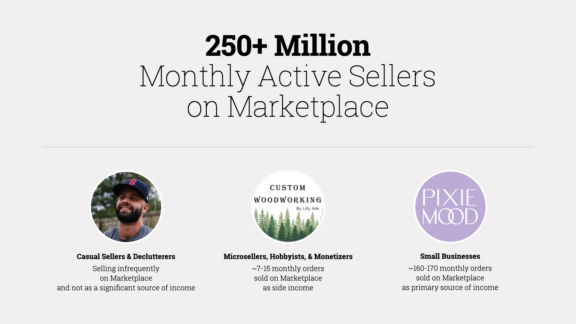
There are over a billion people worldwide using Facebook Marketplace every month.
Approximately 25% of them are selling things.
While most are selling casually to declutter, there are also hobbyists and professional sellers making a portion of their income by selling on Marketplace, and the tools they use needed to be designed in consideration of their different motivations and transaction volumes.
My Role
- Product Definition
- User Experience Design
- Visual Design
- Software Prototyping
Marketplace Seller Archetypes
Having led the design of Buy-Sell Groups before I left Facebook in 2015, I returned to Facebook in 2019 to lead seller experience design within the Marketplace org.
While I also worked on numerous other projects—including buyer-facing features on Marketplace, these are some of the core seller experience projects I was most proud of designing.


Commerce Profile Redesign

The Commerce Profile is a key part of listings on Marketplace, and it serves a variety of purposes for buyers and sellers.
With the prevalence of scams on Marketplace, people will often look at the Commerce Profile for trust signals such as ratings, things in common, and how long they have been on Facebook.
Buyers may also be interested in other items sellers have available now or what they might sell later.
For sellers, the profile is an opportunity to convey their personality and assurance to buyers in addition to offering other items for sale.
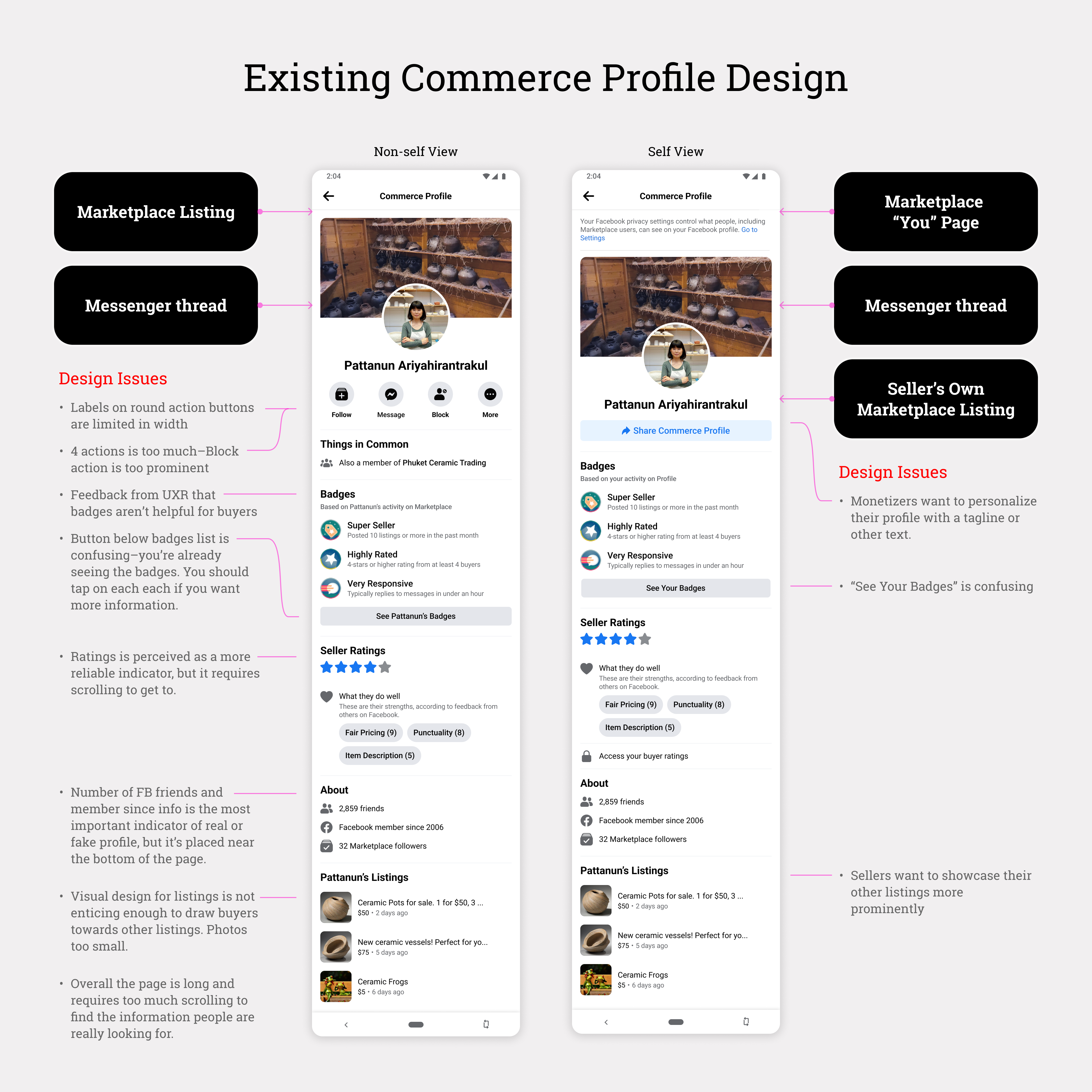
Existing Commerce Profile Design
Problems with the existing Commerce Profile were becoming apparent as more features were added over time and even more were being planned.
The existing page structure was quickly becoming crowded, making it difficult for buyers to find key information and limiting ways sellers could present themselves and their listings.
Prior research also suggested issues with the existing information hierarchy—people often could not find key information without scrolling.
In redesigning the Commerce Profile, I needed to satisfy these buyer and seller needs:
As a buyer on Marketplace:
- I am looking to find evidence that a seller is trustworthy. Buyers are primarily looking for trust signals and to get a sense of who the seller is before making a commitment to purchase something. The existing Commerce Profile is limited in trust and brand signals, so in order to get more information, Buyers will scrutinize various aspects of the seller's public Facebook profile.
- I want to connect with sellers I might buy from again. In certain markets, such as the Asia-Pacific region, buyers frequently follow or friend sellers for re-engagement purposes, since overcoming the trust barrier comes at a higher cost for them.
As a seller on Marketplace:
- I want buyers to trust me. Sellers need more ways to convey they are real and trustworthy sellers. While ratings are a good first step, written reviews from past buyers can boost the seller's reputation.
- I want buyers to know other items I am selling. Whether they are selling casually or to make income, sellers on Marketplace could benefit from being able to show their other listings.
- I want to differentiate myself from other sellers. The Commerce Profile should afford opportunities for sellers to personalize their brand and enable them to tell their story.
- Expandable Sections: We would show up to 3 reviews before having a link to show more reviews on the page. The listings section works the same way, ensuring the link to the main Facebook profile is accessible no matter how many listings the seller has. This concept is scalable to new content, easy for buyers to understand, and it would be the easiest to implement from a technical standpoint. However, the seller's other listings would be situated further down the page than the existing design.
- Section Carousels: Reviews and listings would be presented in horizontal carousels, therefore limiting the vertical page scrolling. Though this approach seemed promising, it would require new profile page components and introduce additional page navigation hierarchy.
- Tabs: The tab design proposal borrows existing components from Pages on Facebook. As buyers scroll through each tab, the tabs lock in place at the top of the screen. This design is highly scalable but also the most difficult to implement, due to Pages and Marketplace being built on different technical stacks.
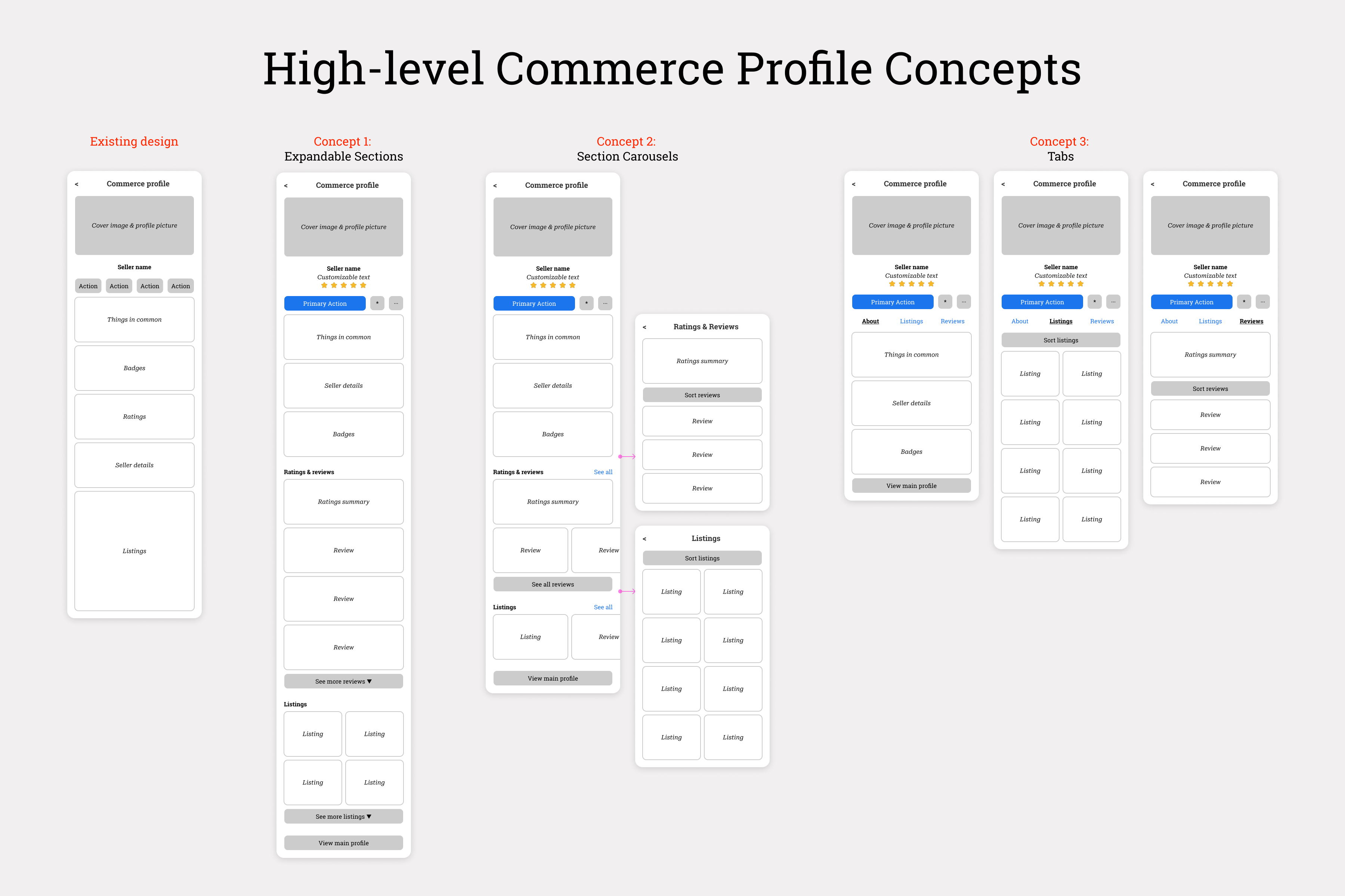
Commerce Profile High-Level Concepts
In each of the three concepts, I elevated a summary of the seller ratings and Facebook details such as the join date toward the top of the page, since these were often cited as the two most important trust elements on the profile.
The concepts were developed further for rolling research sessions, and feedback was generally consistent among the participants:
- Profile pages would be long and overwhelming if there are a lot of seller details, badges, and reviews. Finding other listings from the same seller would require too much scrolling in the Expandable Sections concept. Likewise, the horizontal carousels for reviews and listings on the Section Carousels concept was not preferred.
- On the Section Carousels design, having additional navigation to new pages for "All Listings" and "Ratings & Reviews" placed a higher cognitive load on users.
- Although tabs are not as simple to use as a single scrolling page, this approach was preferred over the other concepts because it offered the most direct and visible path to key profile information.
- This direction seemed easy for buyers to understand, and it enabled them to get directly to reviews and other listings without having to hunt for this information.
- The scalable Tabs structure would also ensure other teams could pursue additional features with minimal impact to other features on the profile.
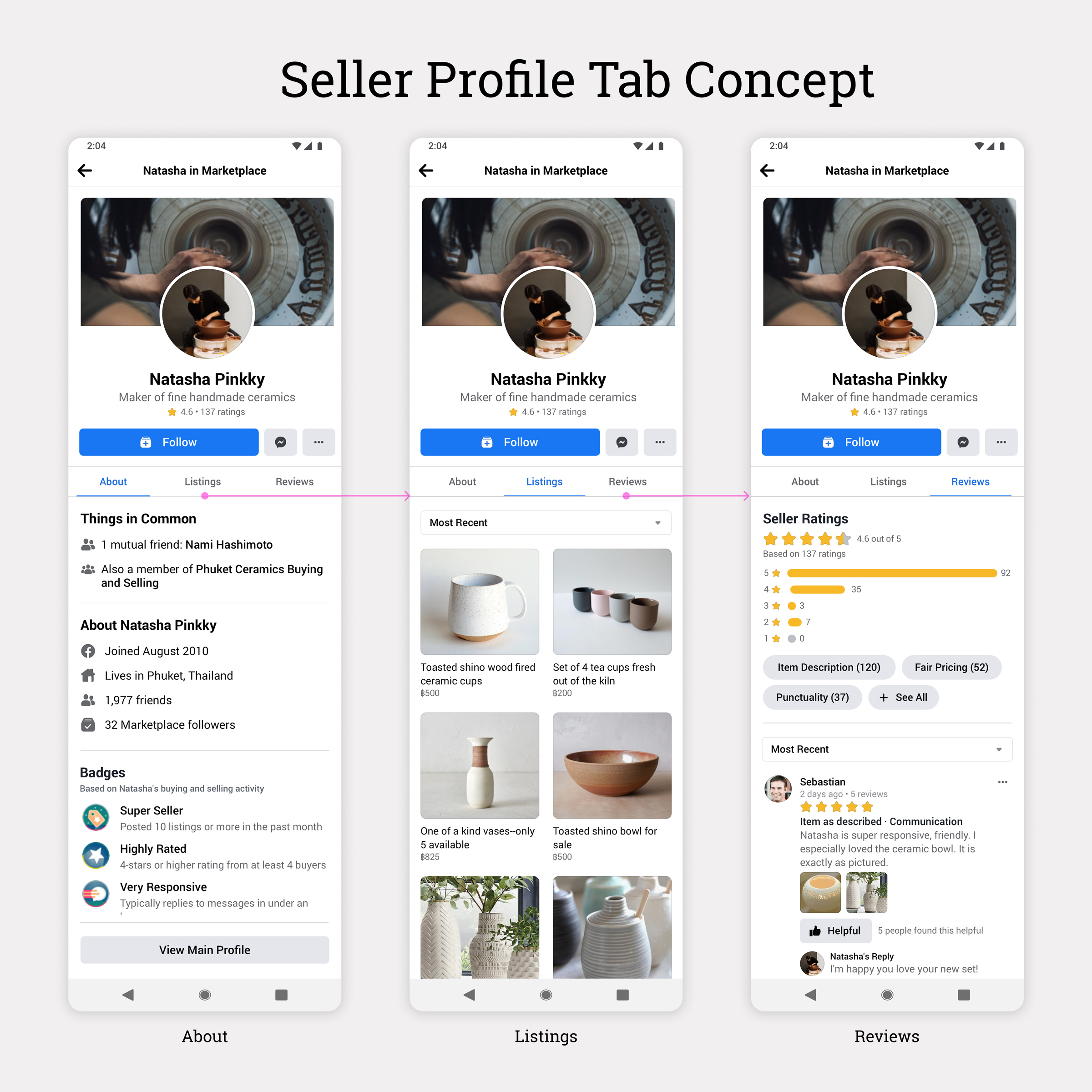
Commerce Profile Tab Concept
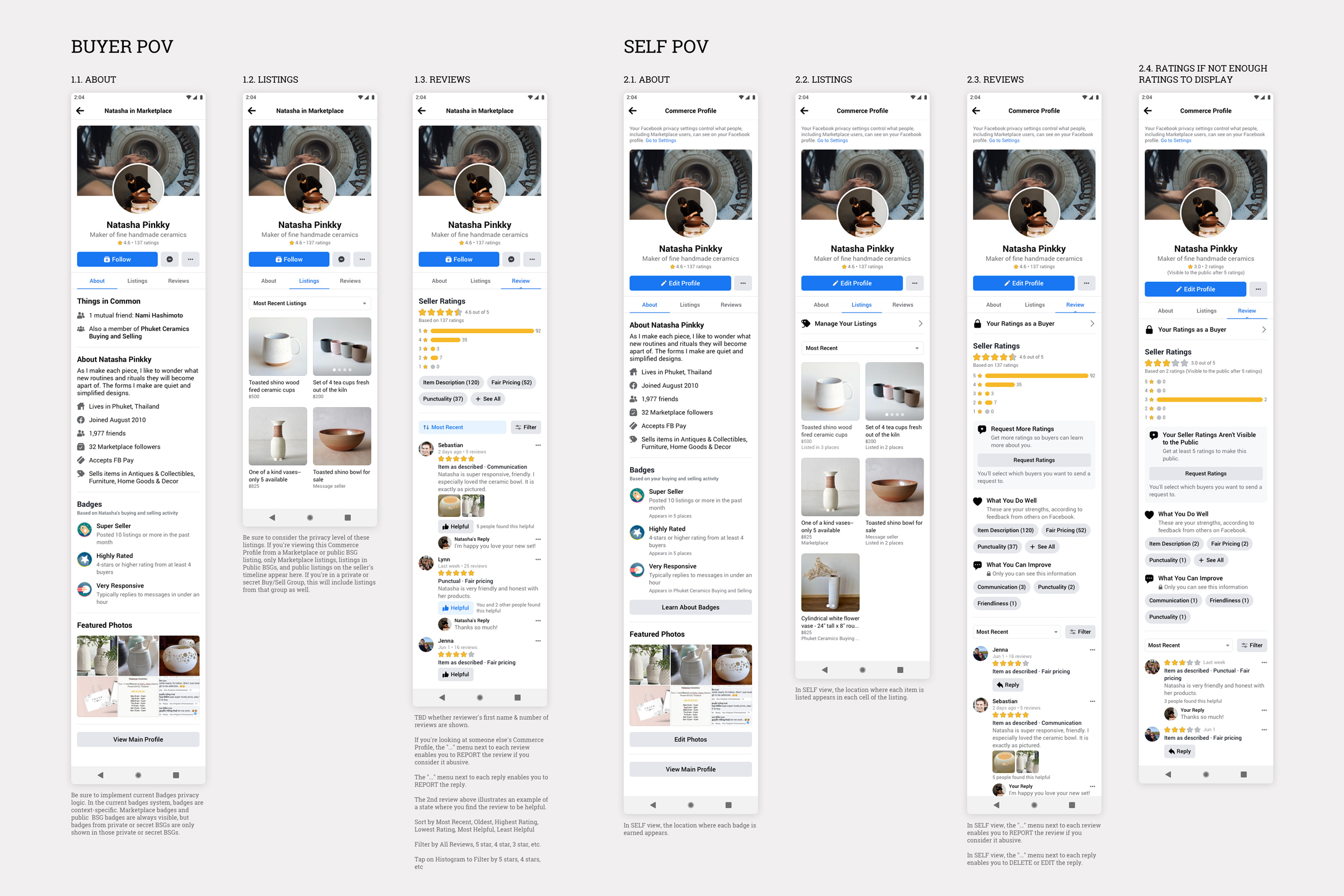
Commerce Profile Tabs - Detailed Design for Buyer and Self View
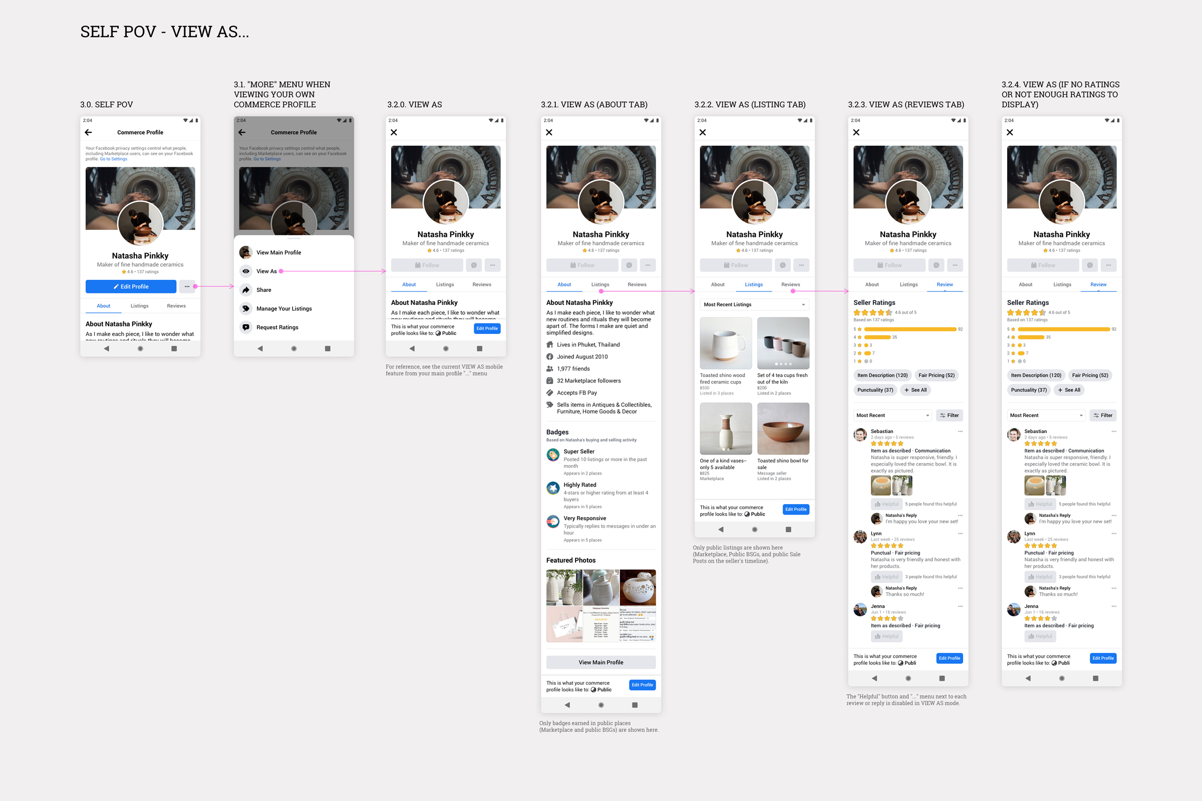
Commerce Profile Tabs - Detailed Design for "View As"
I also explored ways sellers could personalize their commerce profile by adding a tagline, short bio and featured photos.
However, the team decided to prioritize other ongoing projects, and only tagline editing survived the final cut.
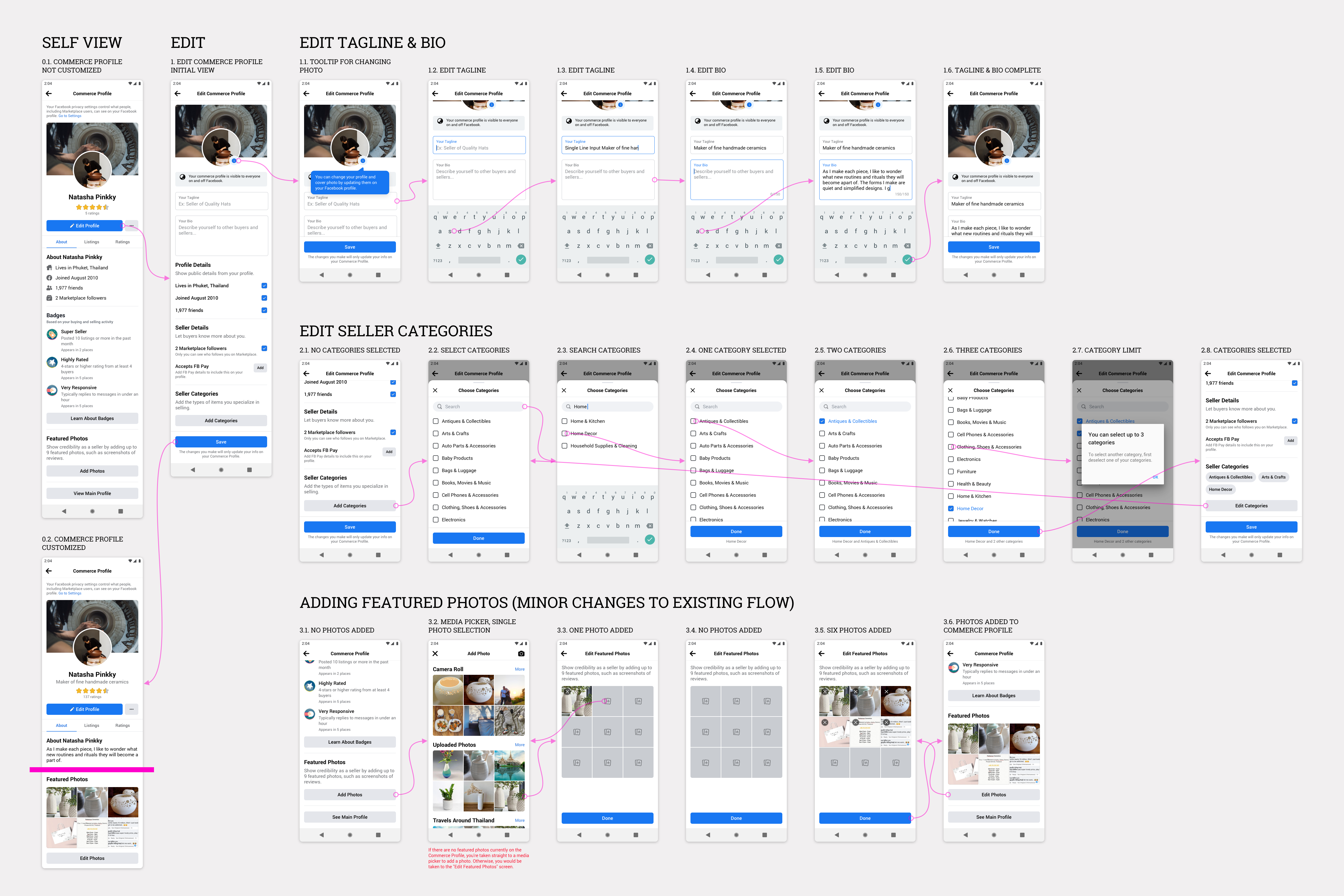
Design Proposal for Editing the Commerce Profile
Lightweight Listing Composer
The existing Marketplace listing composer was structured as a multi-step experience, starting with the listing details and ending in a list of Facebook Buy-Sell Groups where sellers could crosspost their listings.
Starting in 2019, Marketplace began enabling sellers to ship items in the US, and with this came numerous related features and tools targeting professional sellers.
As more selling features were being released, the composer was becoming bloated with advanced features the majority of sellers did not use often.
Unfortunately, this came at the expense of fixing usability and other core issues with the composer—leading to steady drops in its completion rate.
As part of a larger initiative to grow the number of listings on Marketplace, my design goal for this project was to make it easier for sellers to successfully create listings.
In addition to addressing pain points in the listing creation flow, I also found opportunities to simplify the composer into a single page that would work for the most common selling scenarios.
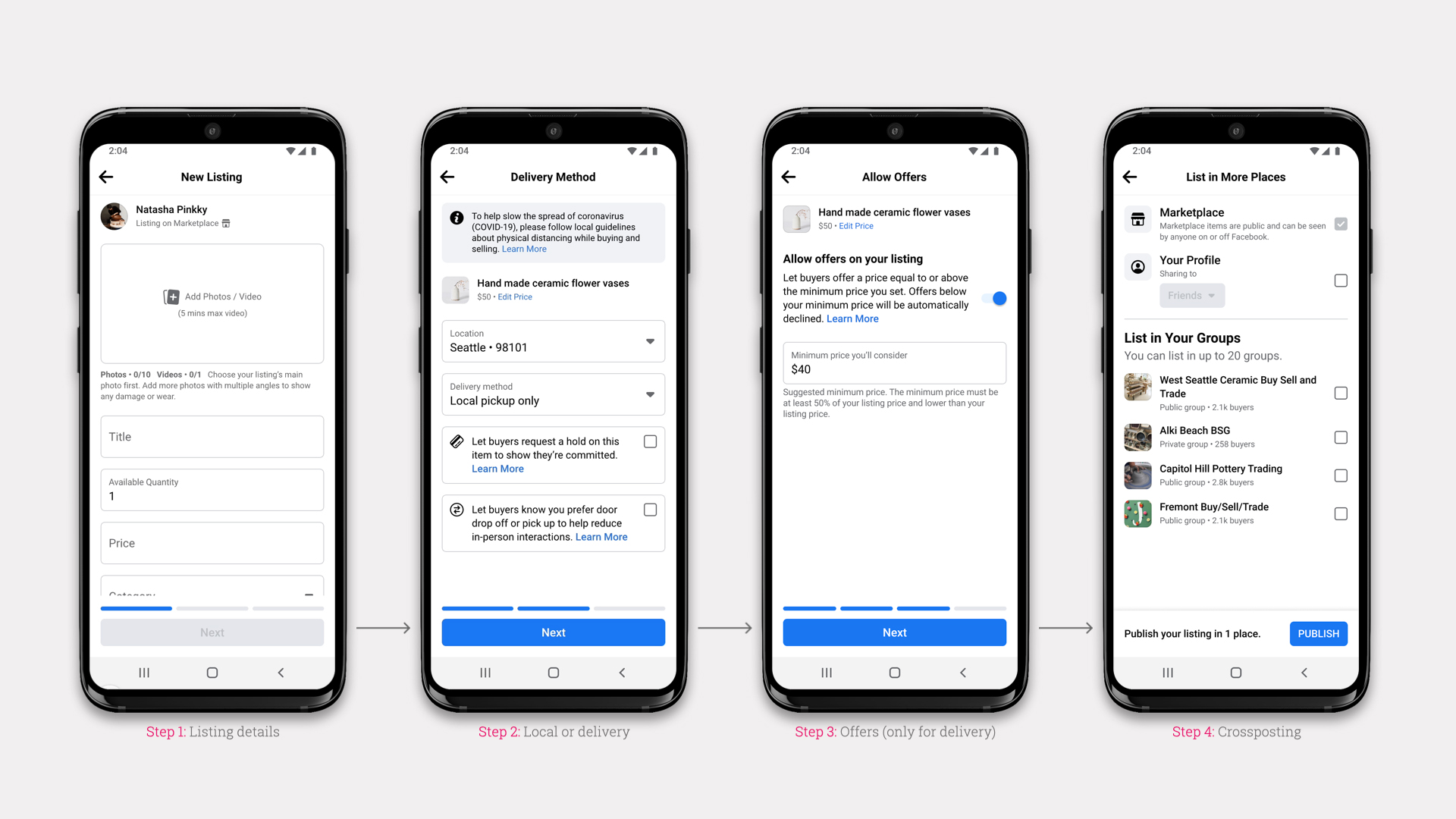
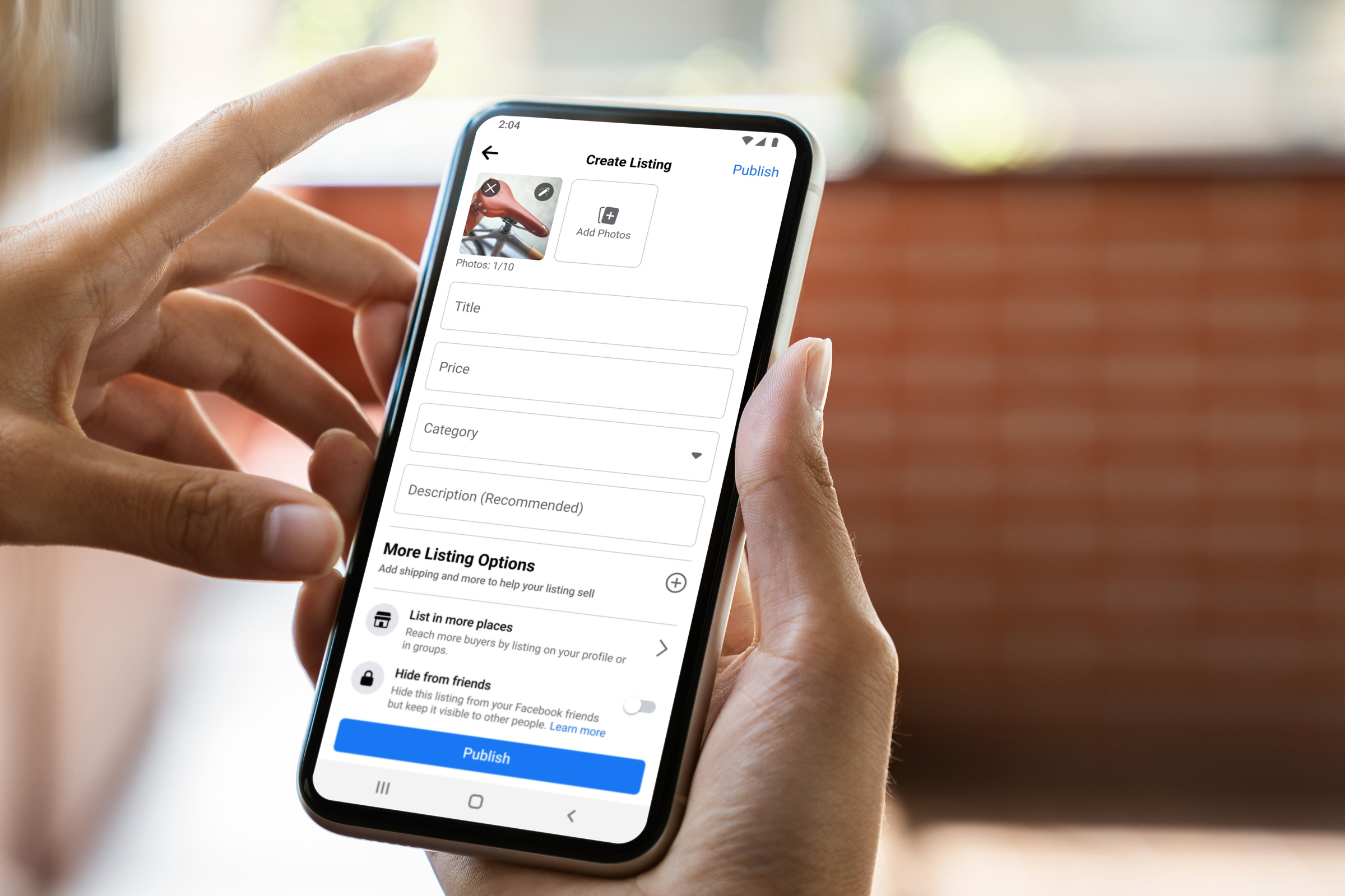
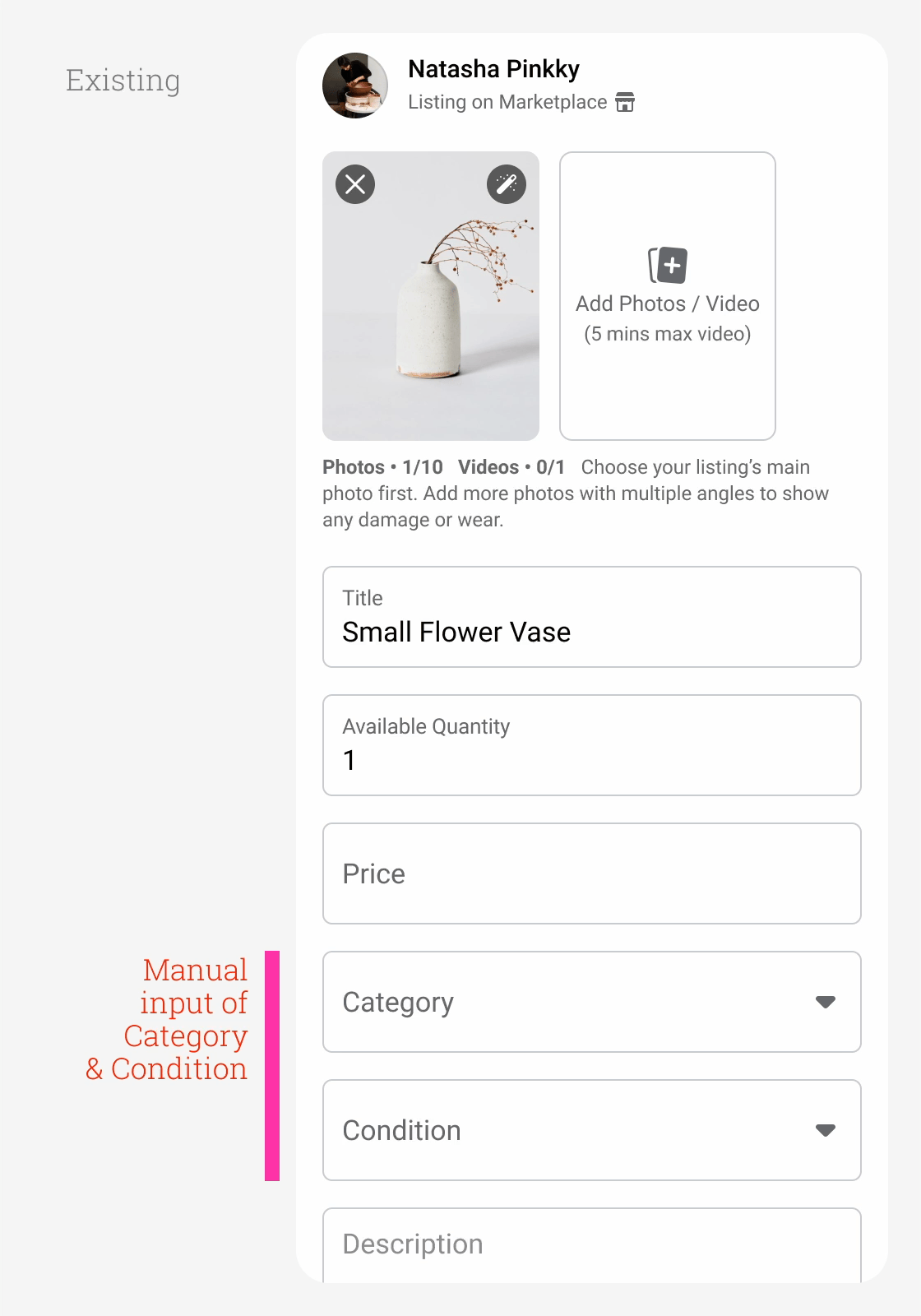
Existing Marketplace Multi-step Composer Design
Existing Marketplace Multi-step Composer Information Architecture


Existing Marketplace Multi-step Composer Design
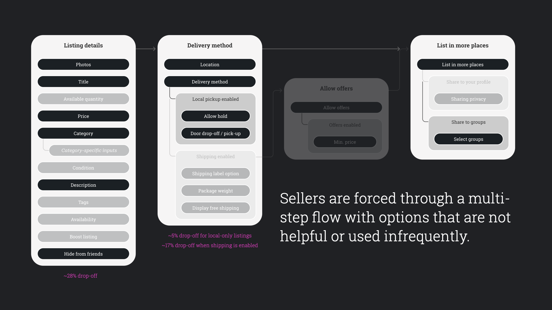
37% of existing Marketplace composer sessions were never submitted for publishing.
Prior research on the existing composer experience suggested a number of issues which could have contributed to sellers not finishing their listings:
- Too many listing details required, many of them below the fold.
- 90+% of listings are single quantity but this appears above the fold.
- Listing categories are difficult to choose.
- Confusing content ("Available quantity" vs. "Availability").
- Composer experiments and growth initiatives result in more clutter.
- Forced steps (delivery method, allowing offers, and crossposting) make the composer flow unnecessarily long and confusing.
- Selecting delivery method results in insertion of an additional step (offers).
The team goal was to improve the composer listing completion rate while remaining neutral to Marketplace top-line metrics for local listings (meaningful listing interactions) and shipped listings (transactions).
We devised two general approaches to achieve this goal.
- Input optimizations: We would find ways to make it easier for people to add details to their listings by improving the content and usability of existing form inputs.
- Flow and structural changes: We would explore ways to reduce overall friction by re-examining the composer organization and multi-step flow.
Input Optimization Opportunities
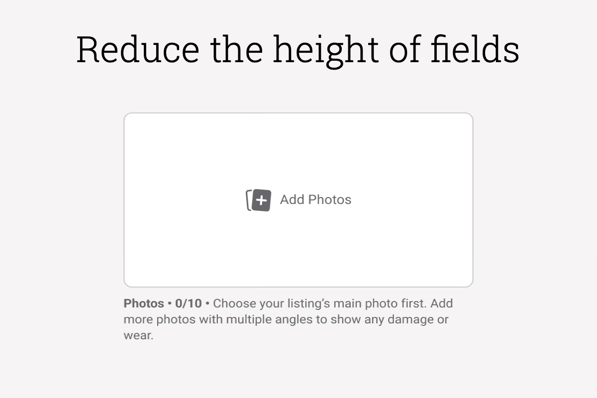
Some composer fields took up too much vertical space, pushing required fields further down the screen.
To reduce workload, there were field values we could set automatically.
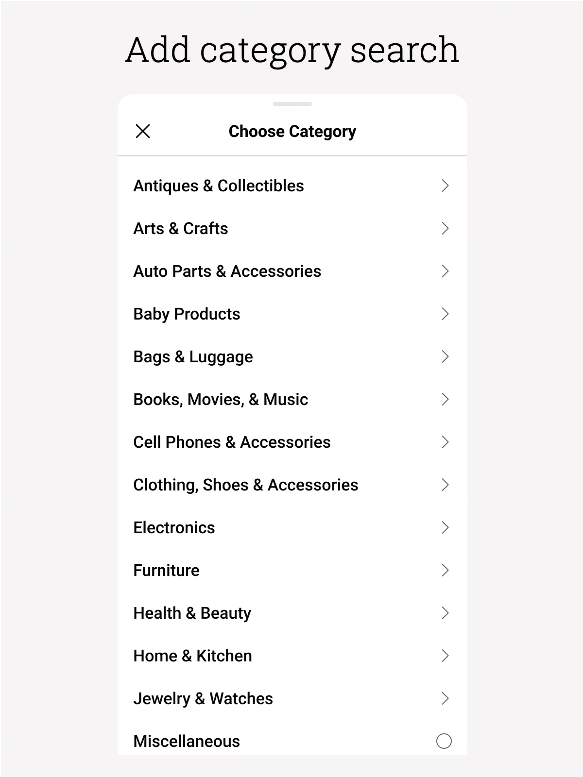
Category selection was the biggest pain point for our sellers and where we saw the biggest drop-offs in listing completion.
Input Optimization Designs
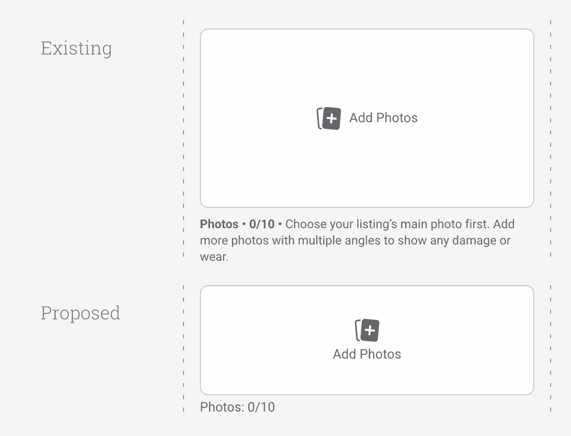
I proposed to reduce the height of the image area and simplify the hint text content below it.
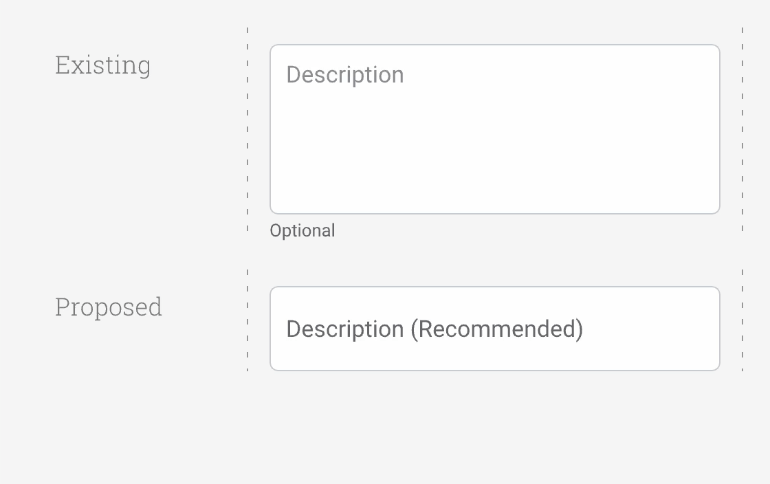
We could implement a dynamic height text input box instead of a fixed height multi-line text input box.
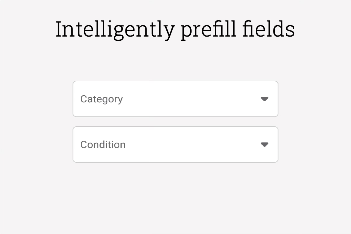
Category and condition could be automatically selected by analyzing the photo and listing title.
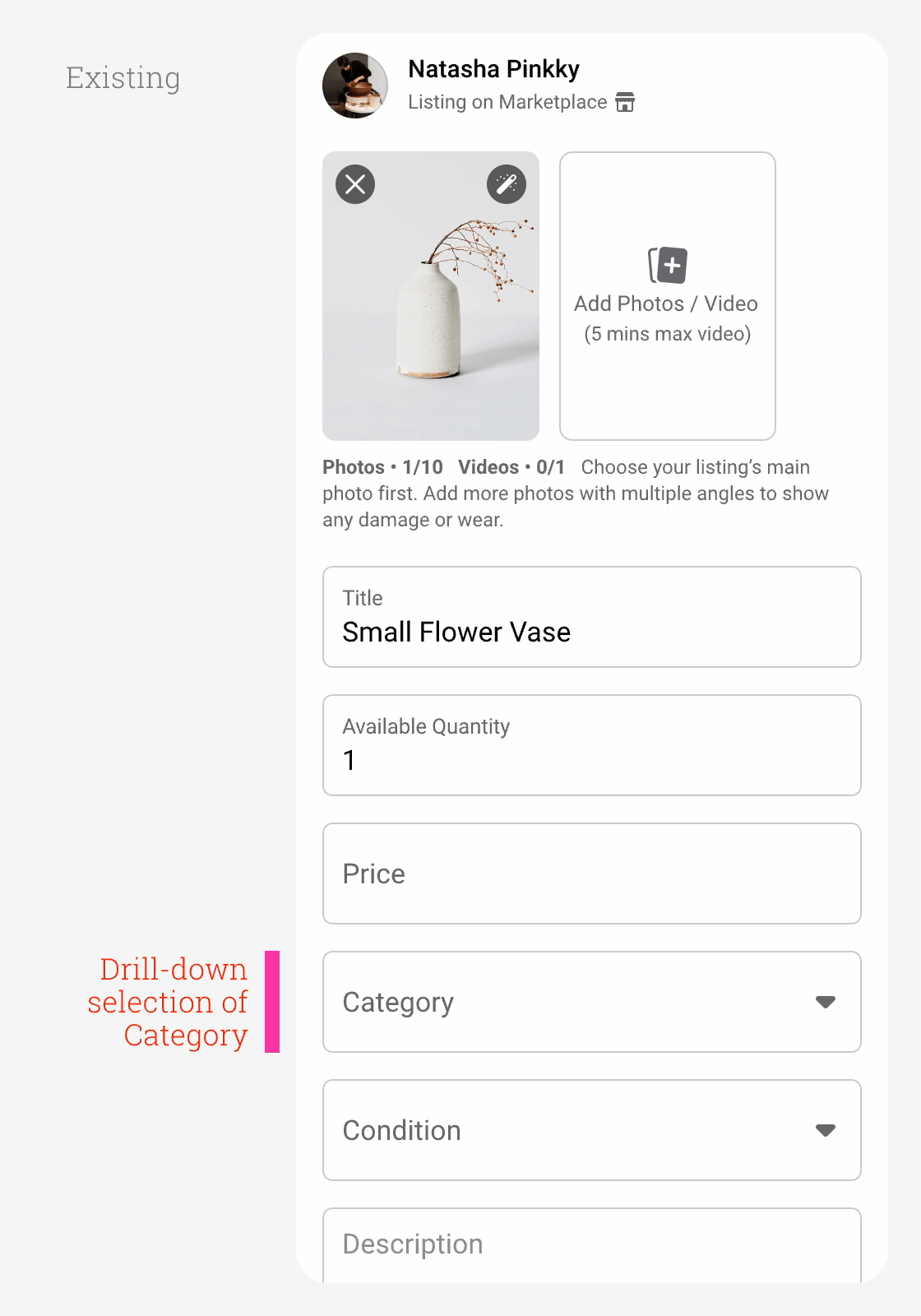
Implementing a search feature could make category selection easier.
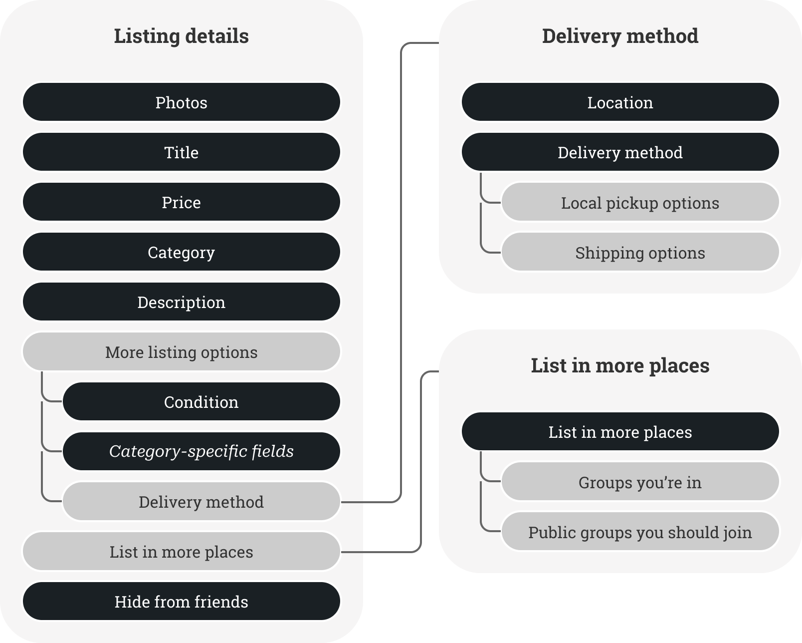
Composer Flow and Structural Concepts
Concept 1: Hub & Spoke
Only essential composer fields—photos, title, price, and description—are immediately visible.
All other composer fields, including category, condition, and shipping options are placed on a separate page accessible by tapping the "More listing options" link.
Category and condition would be automatically prefilled after the seller adds a photo and title.

Pros:
- Publish button lives on 1st page and is more visible.
- "Hub & Spoke" navigation is a well-understood design pattern.
- Ability to add new features without bloating the core composer experience.
Cons:
- Potentially important listing details, such as condition and category, are automatically set without the seller being aware.
- May impact number of shipped listings and items crossposted to Buy-Sell groups since users are not forced to see these options before publishing.
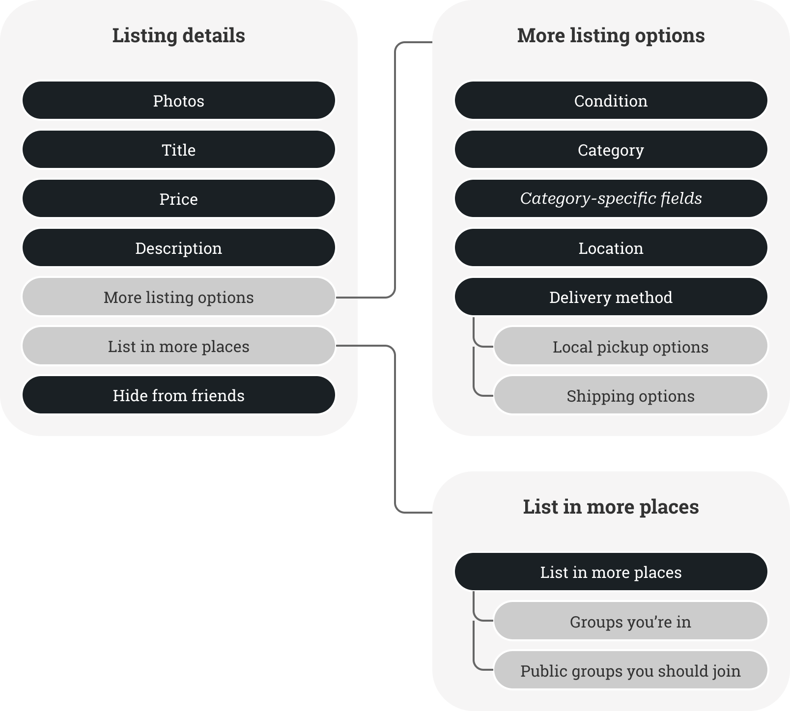
Concept 2: Accordion
Basic listing fields including category are immediately visible.
Tapping "More listing options" expands the page to show other listing fields and shipping options.

Pros:
- Publish button lives on 1st page.
- Additional listing details placed adjacent to core listing details.
- Category is immediately visible.
Cons:
- Expanded Listing Options section can make the page more unwieldy.
- Publish button pushed further down the page than Hub & Spoke concept.
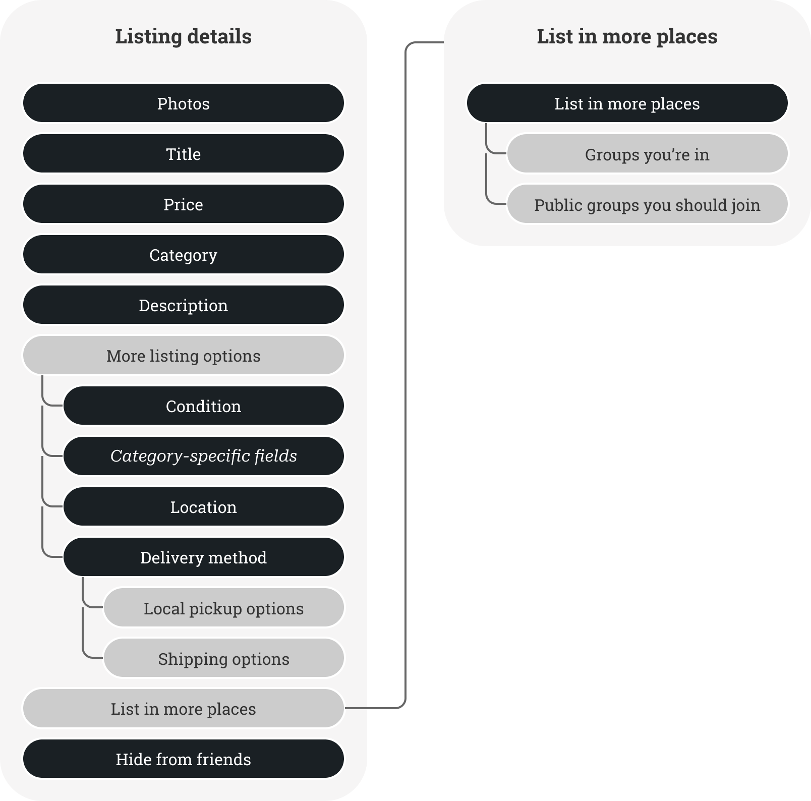
Concept 3 (Selected Design): Hybrid
This concept utilizes the strengths of both the Accordion and Hub & Spoke concepts.
Basic listing fields including category are immediately visible.
Condition and a link to shipping options is available when expanding the "More listing options" section.
A separate page handles Shipping options.

Pros:
- All the benefits of the Accordion and Hub & Spoke concepts.
- Expanded listing options is less cluttered—Shipping options have more room on a separate page.
Cons:
- Publish button pushed further down the page than Hub & Spoke concept.
Composer Design Direction and Product Impact
After testing and refinement—including the implementation of composer field optimizations—the Marketplace Composer Team launched the Hybrid Concept, blending the strengths of the Accordion and Hub & Spoke concepts.
- With work being done to automatically set Category based on photo and title inputs, it made sense to show this to sellers without having them navigate to a new page or expand a section of the page.
- Because the majority of items on Marketplace were used, it would be acceptable to hide the Condition field in the initial view.
- With more shipping features being developed in parallel, the composer design would benefit from having shipping options placed on a completely separate page.
- 78% Completion Rate: The percentage of composer sessions with a photo completed for publishing
- +21 Million Listings Completed Each Month: New published listings worldwide each month over the multi-step flow
- +1.7% Meaningful Listing Interactions: Improvement to the number of meaningful conversations between buyers and sellers on local listings
- +1.3% Shipping Transactions: Improvement to the number of transactions for listings with shipping enabled
Lightweight Shops Onboarding

As more shipping features were being added for sellers on Marketplace, it started becoming a more viable platform for small businesses and sellers with monetization goals.
It became commonplace to see more things for sale on Marketplace that were clearly from businesses, but people were selling using their main Facebook profiles instead of as their Facebook business pages.
There was a push to get these sellers onboarded as Shops on Marketplace for regulatory reasons, but also so buyers could feel more confident about their shipping purchases.
However, the existing Shops onboarding flows were not performing as well as expected—the completion rate for Shops onboarding was poor, and Facebook struggled to get sellers onboarded as businesses.
After completing designs for the Commerce Profile and Composer, my work on the seller experiences team began shifting toward more business-centric work.
Getting more Shops onboarded to Marketplace became a priority.
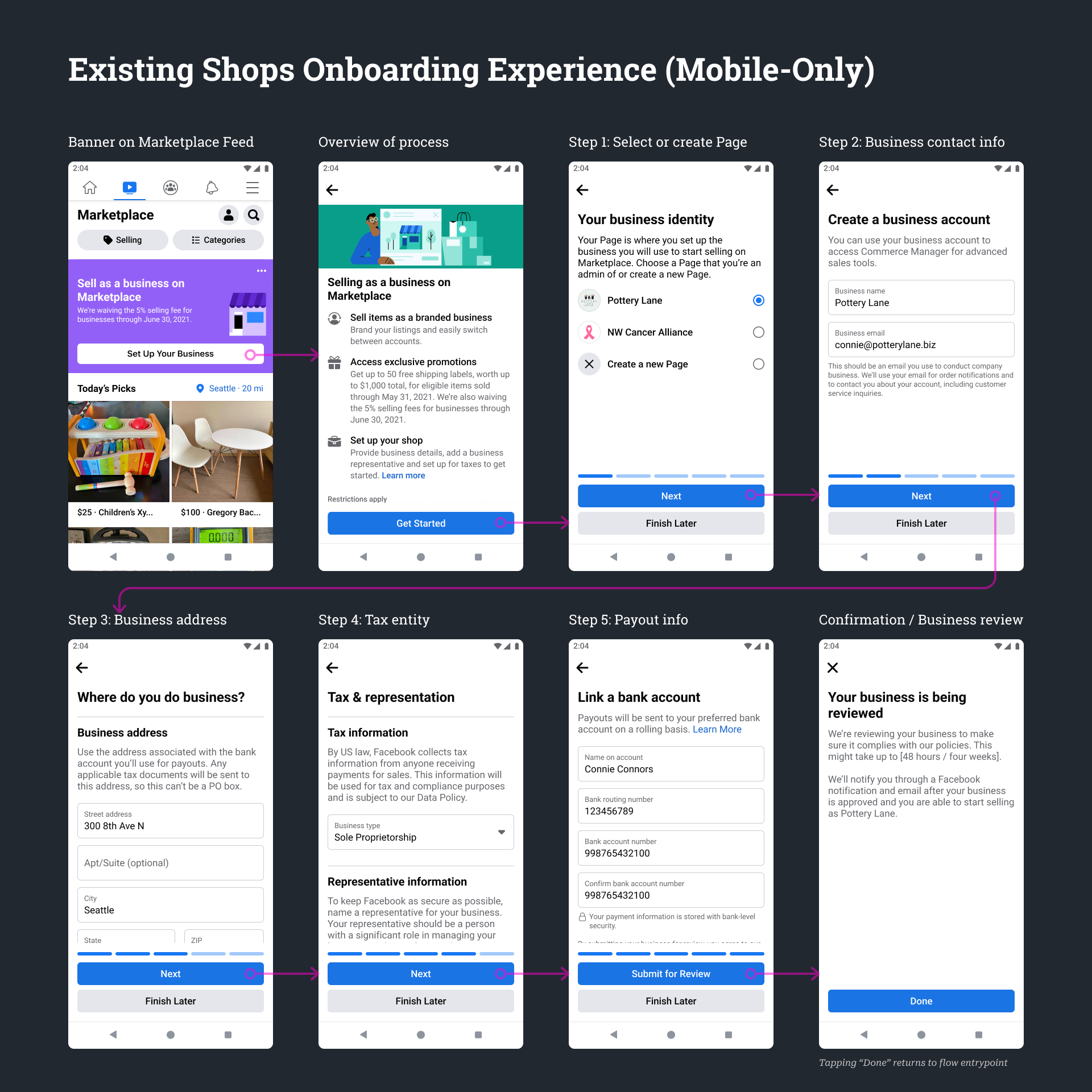
Existing Shops Onboarding Experience
I started this project by trying to understand the reasons why sellers weren't onboarding as Shops, and discovered several areas of friction for sellers:
- Motivation: Sellers simply did not understand why they should be onboarding as Shops on Marketplace. They were already making sales with their main Facebook profiles.
- Mobile-first onboarding: Our existing Shops onboarding flows were only launched on the FB mobile app. Sellers operated their businesses mainly on their laptops, and entering a lot of onboarding information on a mobile device was cumbersome.
- Unnecessary onboarding steps: Sellers were being asked bank payout and tax information before making a single sale on Marketplace. Facebook might be able to get more businesses onboarded if we could get this information after they've made a sale on Marketplace.
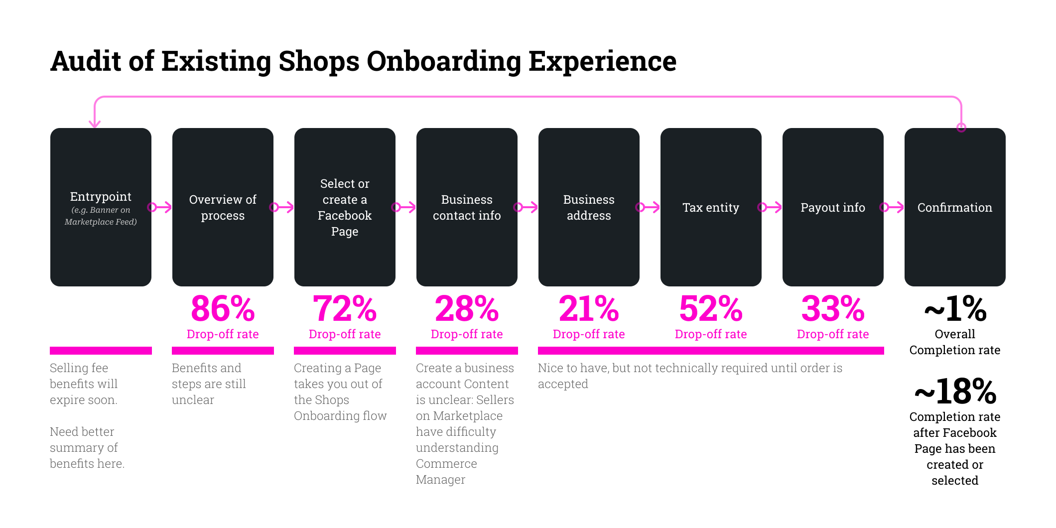
Audit of problem areas in the existing onboarding flow
Taking the original flows as a starting point, I focused on the following design opportunities:
- Providing better seller education and incentives to sell as a Shop: Sellers simply did not understand why they should be onboarding as Shops on Marketplace. They were already making sales with their main Facebook profiles.
- Creating a Desktop experience: Our existing Shops onboarding flows were only launched on the FB mobile app. Sellers operated their businesses mainly on their laptops, and entering a lot of onboarding information on a mobile device was cumbersome.
- Building a lightweight onboarding experience: Sellers were being asked bank payout and tax information before making a single sale on Marketplace. Facebook might be able to get more businesses onboarded if we could get this information after they've made a sale on Marketplace.
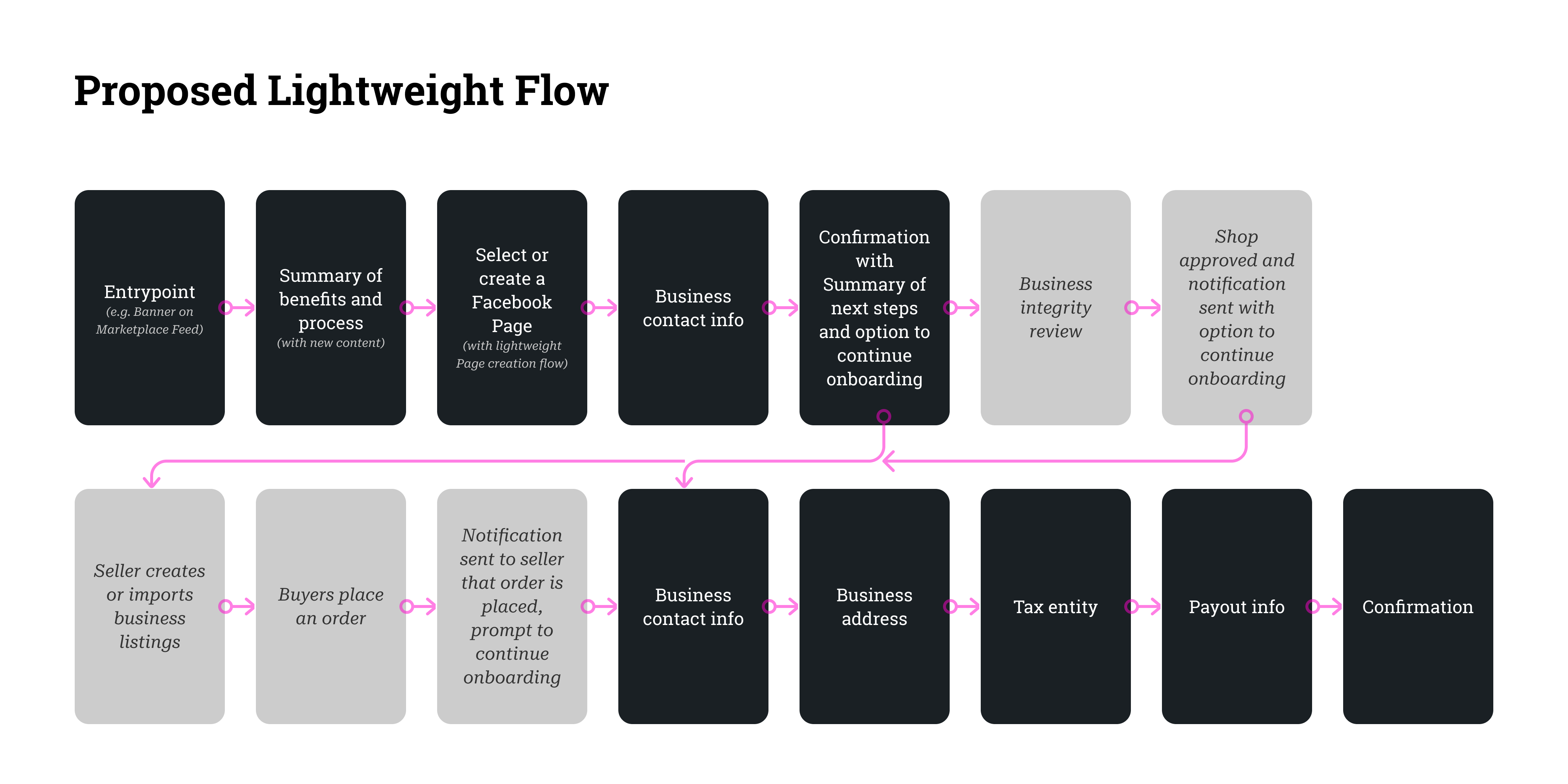
Shops lightweight onboarding flow proposal
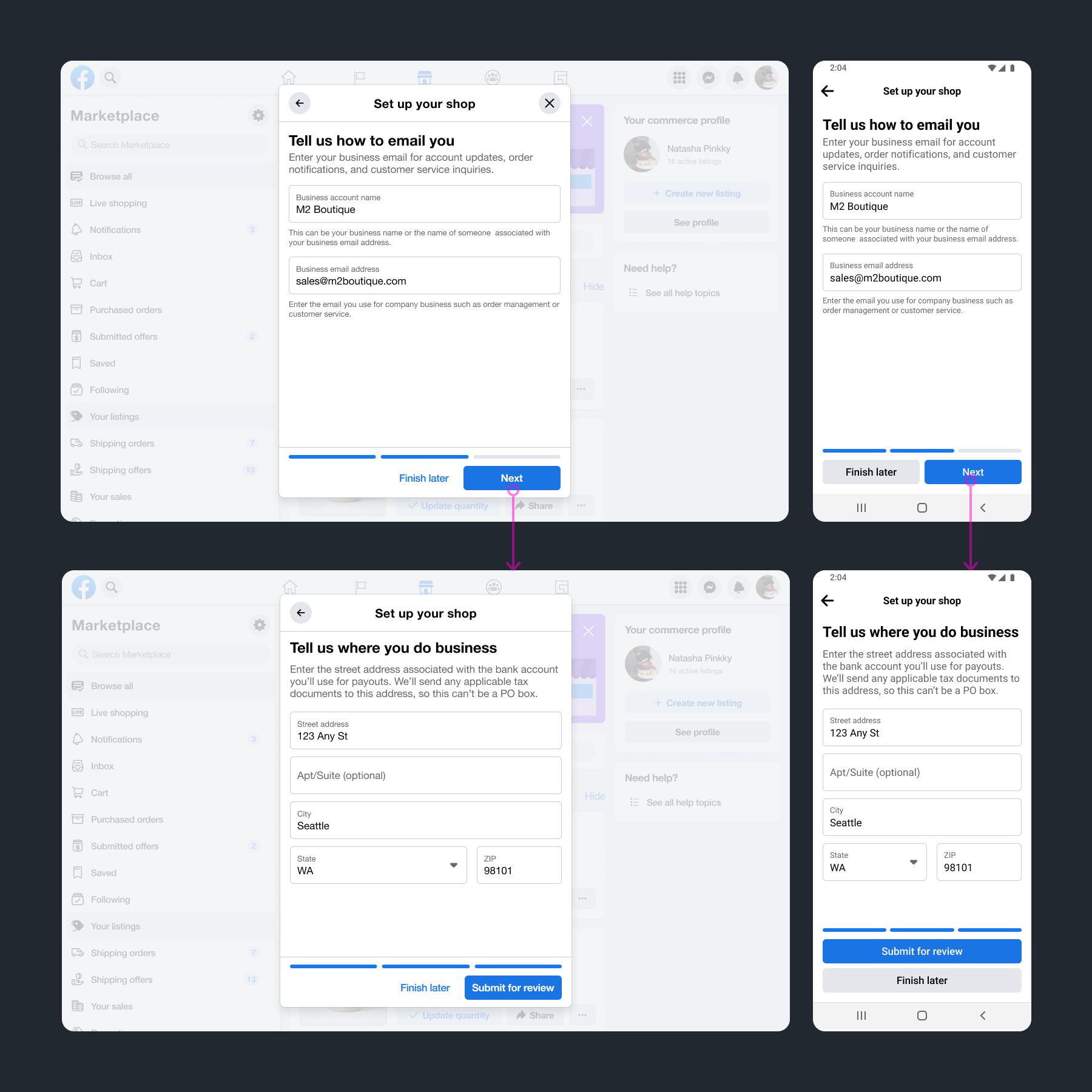
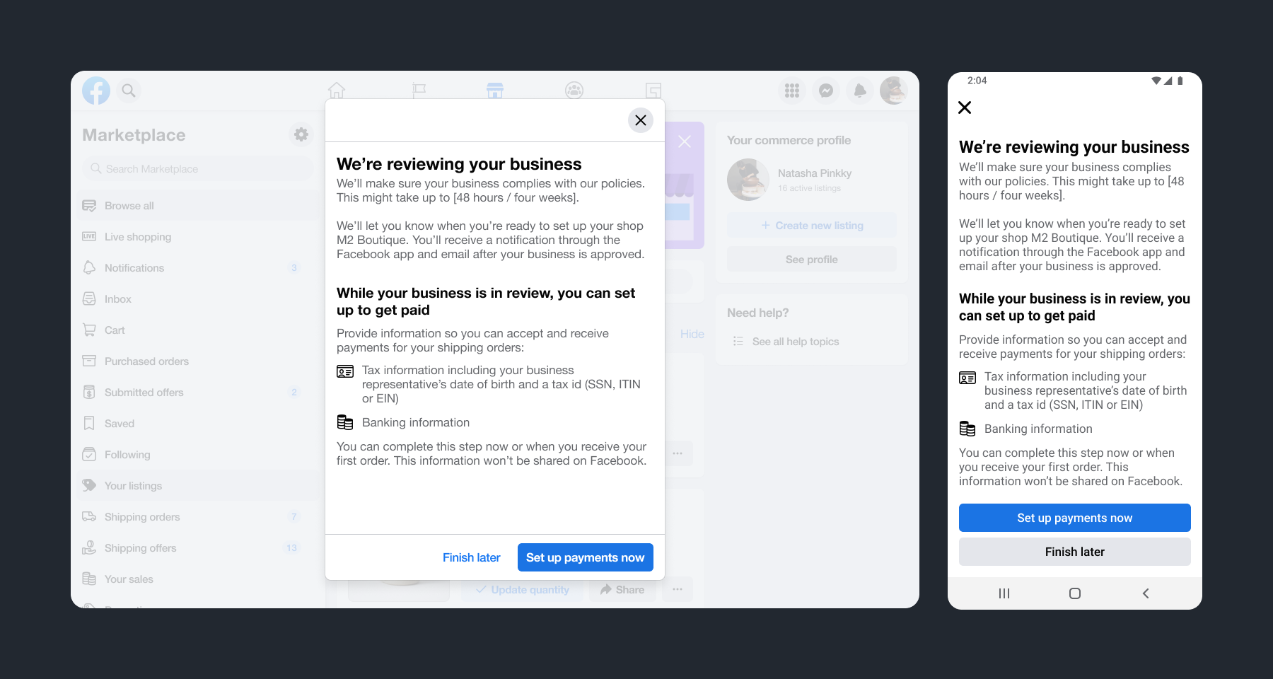
The main idea with the lightweight onboarding flow was to only require basic business contact information and then defer payout-related questions until after the seller receives an order.
After submitting basic business information, the seller could optionally enter payout information or continue setting up their shop by creating listings or importing them from their main Marketplace profile.
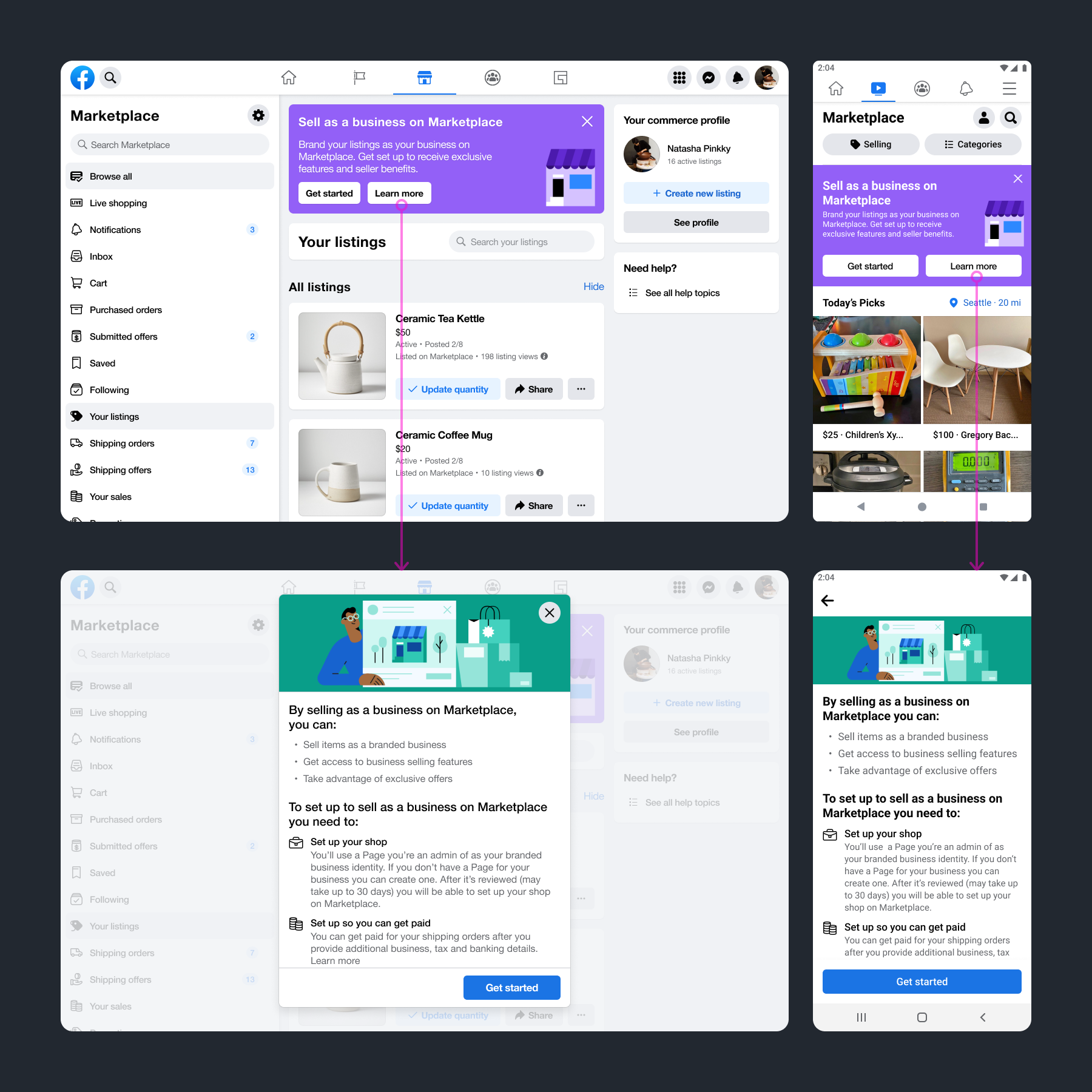
Shops lightweight onboarding design: Entrypoint and overview
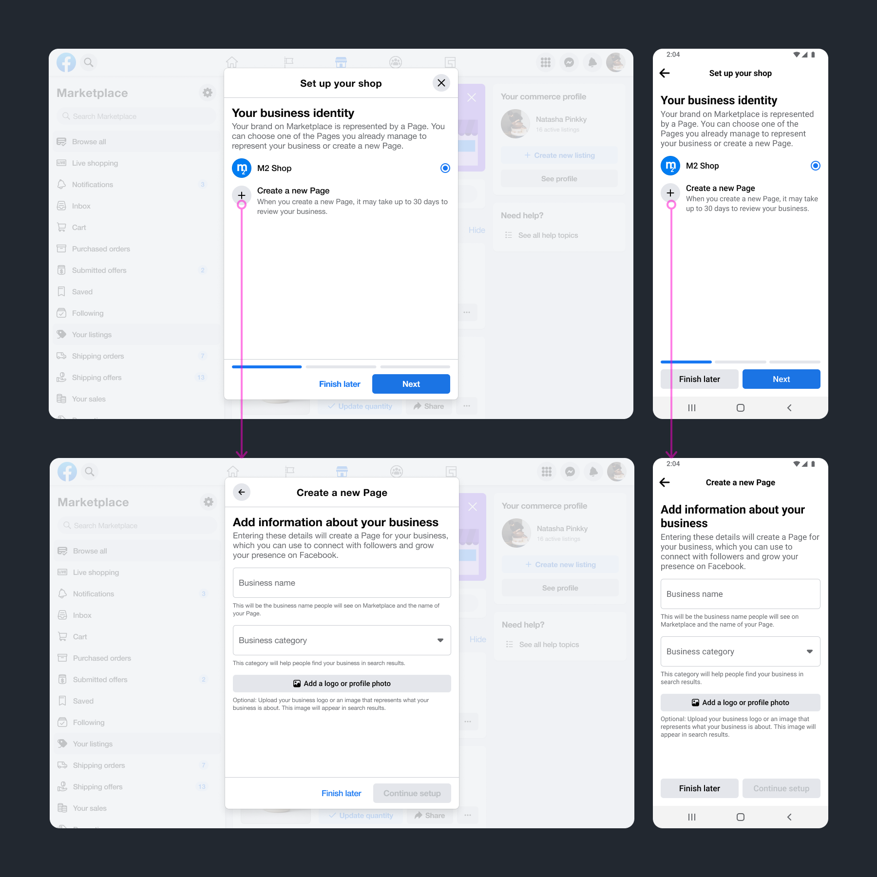
Shops lightweight onboarding design: Step 1 - Select or create a page
Shops lightweight onboarding design: Steps 2 & 3 - Business contact and address
Shops lightweight onboarding design: Next steps
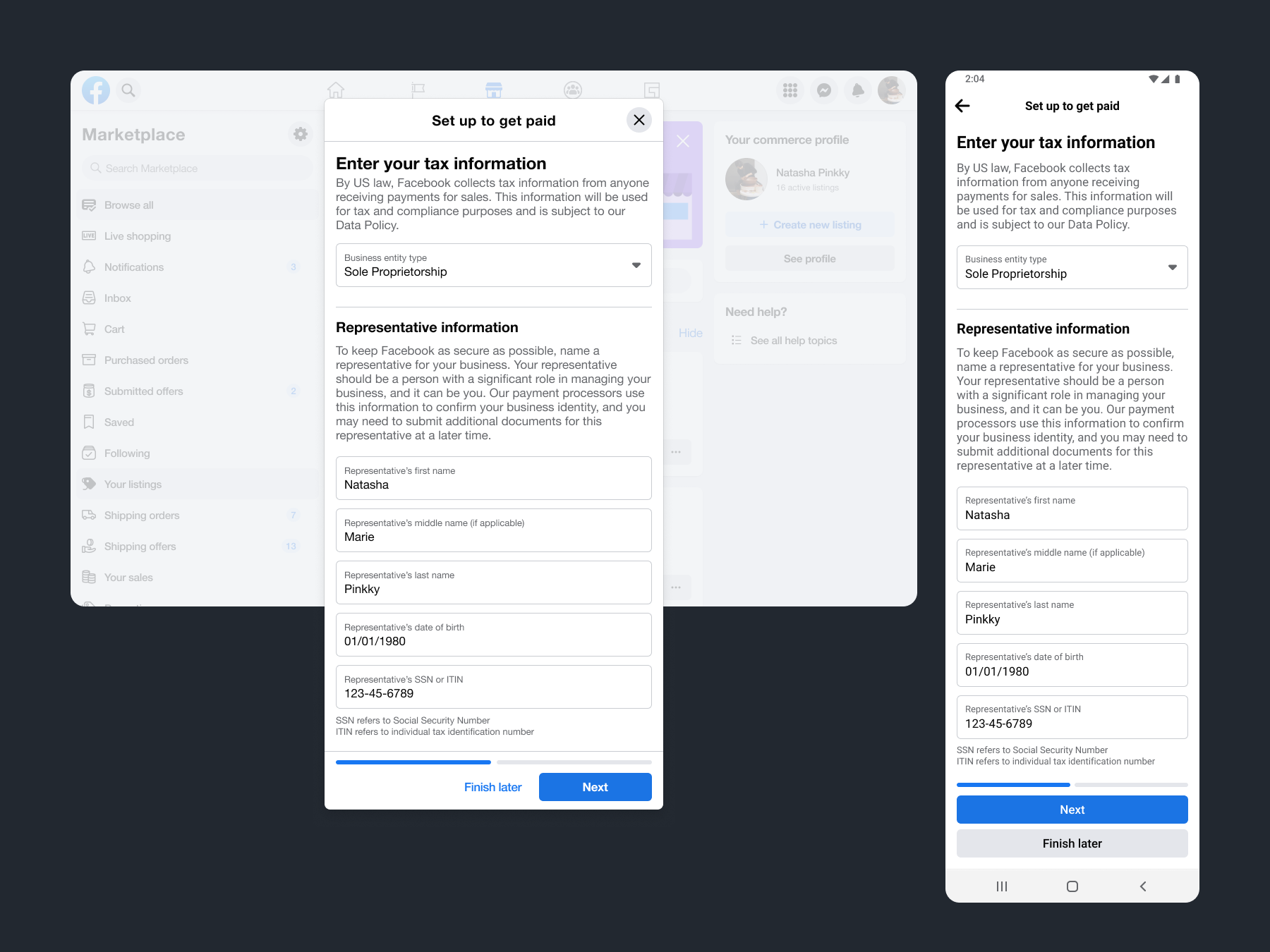
Shops lightweight onboarding design: Tax information
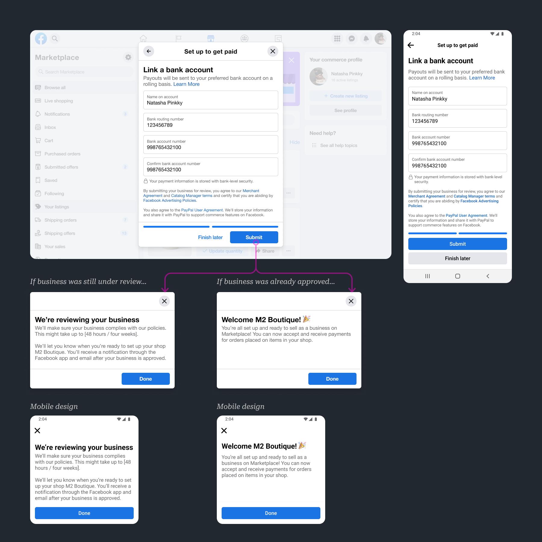
Shops lightweight onboarding design: Payout information
As a result of my design work on Shops onboarding, the team was able to get significantly more Shops successfully onboarded to Marketplace:
- 18%(Existing)→62%(Lightweight) Completion Rate: Sellers who started and ultimately completed all onboarding information within a 30-day period
- +1,700 Shops Each Month: New Shops in the US onboarded each month over the existing Shops onboarding flows
- +32k New Shops Listings Each Month: Improvement to the number of listings sold by Shops
- +529k Shipping Transactions by Shops Each Month: Improvement to the number of transactions made by Shops
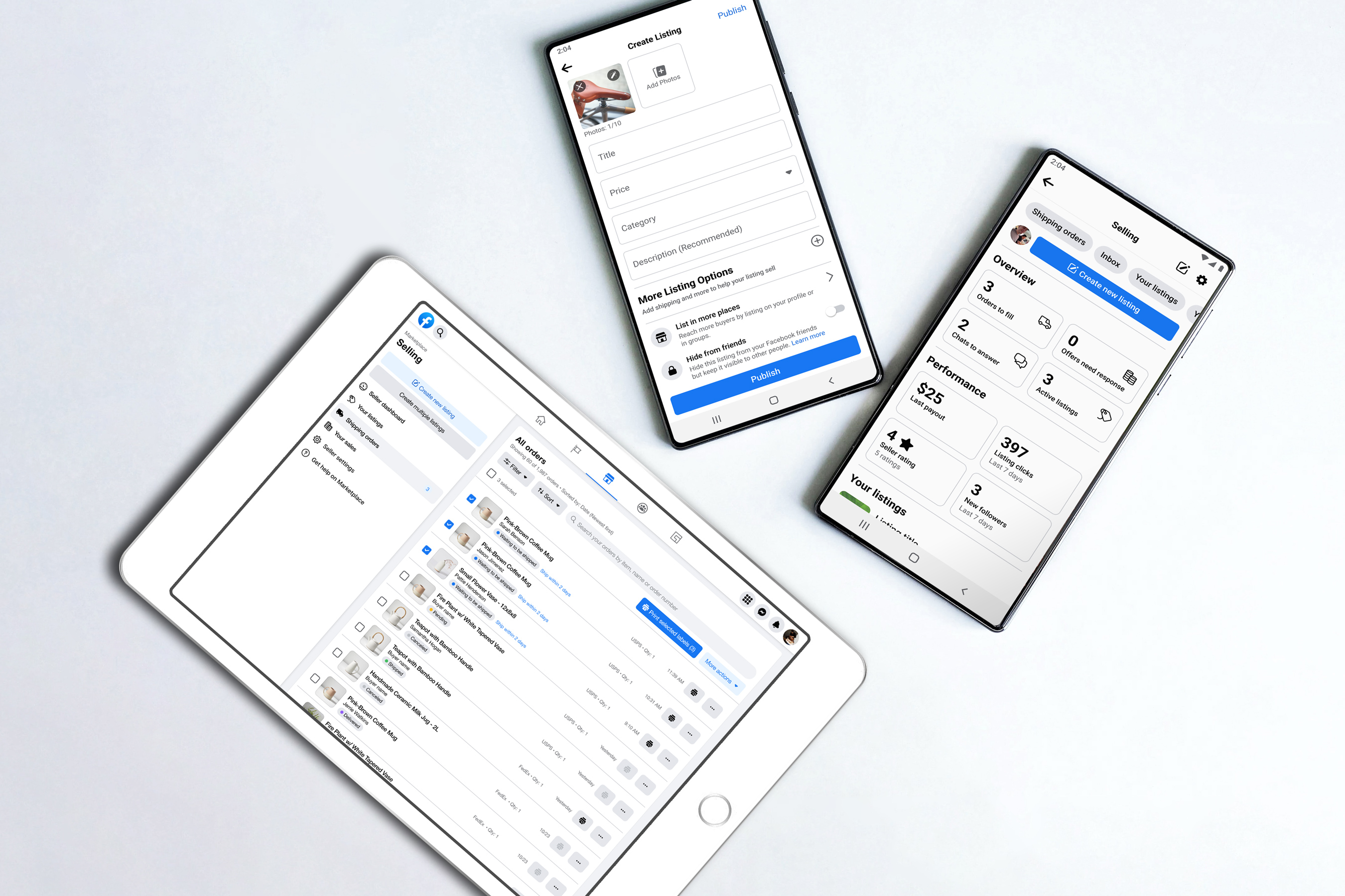
Desktop Web Navigation and Seller Dashboard
Because Marketplace was originally designed for casual selling use-cases, only a bare minimum of features were originally shipped to support the creation and management of listings by sellers.
Most new features were designed as mobile-first experiences, and their desktop web counterpart experiences were often either neglected or built as large mobile experiences.
Even though the Marketplace desktop web experience was often problematic, sellers operating as businesses would use it anyway—simply because they would operate other parts of their business and print shipping labels from their laptops.
To attract more Shops on Marketplace, we needed to provide better incentives and exclusive features for sellers to onboard as Shops instead of selling as their main Facebook profile.
This realization kick-started a number of projects goaled on providing more effective and differentiated tools for sellers operating as Shops on Marketplace.
In starting the work to create better tools for business sellers, it became clear that the navigation on Marketplace desktop web needed to be fixed before we created even more features for these sellers.
The existing desktop web navigation on Marketplace was a long list of buying and selling features, pushing key features such as the Create Listings button and Browsing filters far below the screen fold.
Some of these features, such as offers, were only available when selling as your main Facebook profile, while others were only relevant to Shops on Marketplace.
Navigating between features forced users to abruptly change context between their main Facebook profile and their Shop.
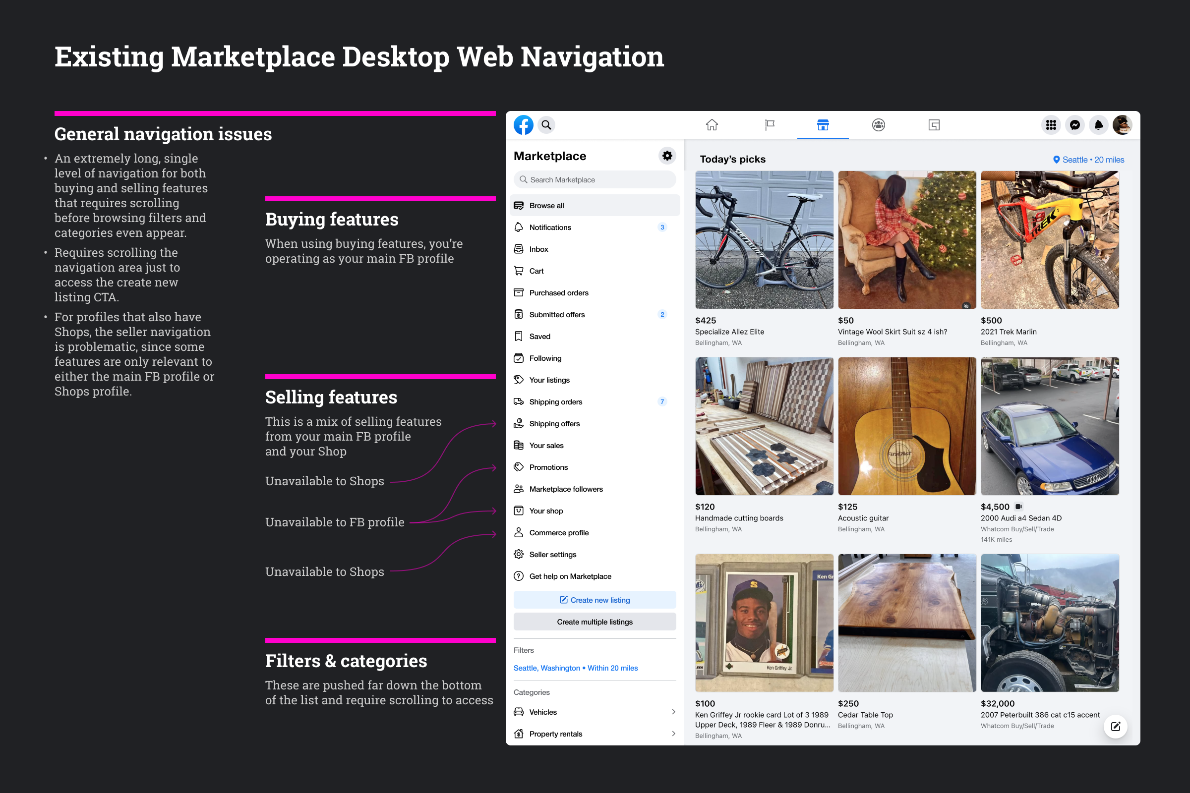
I proposed splitting the navigation into separate buying and selling areas.
With fewer items on the Marketplace landing tab, this would immediately make the navigation easier to digest.
This would also be more scalable—enabling buyer and seller teams to add new features without impacting the main navigation.
Having a separate area specifically for selling would also provide a more natural way to switch between selling profiles and show only the relevant navigation for each profile.
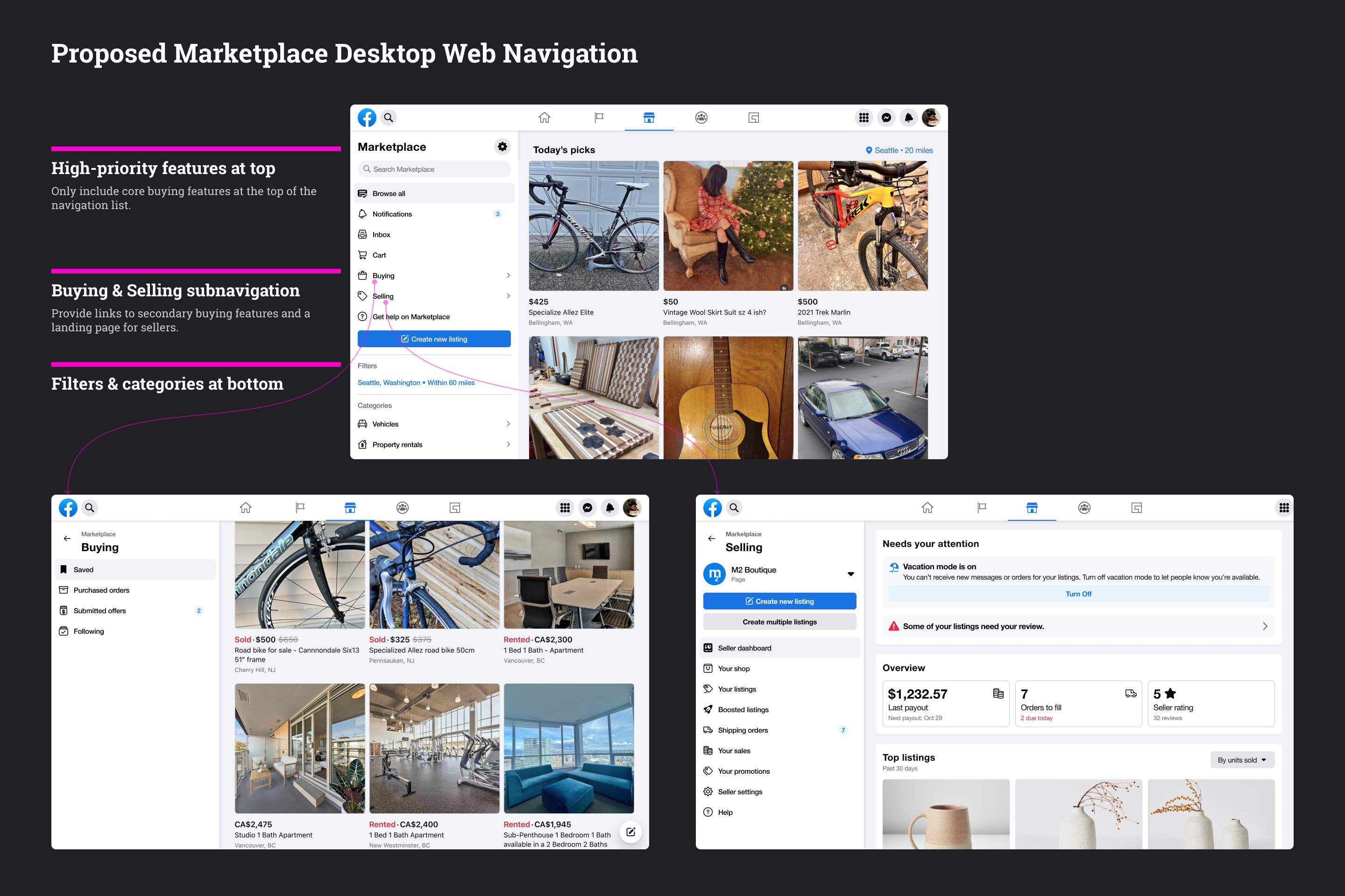
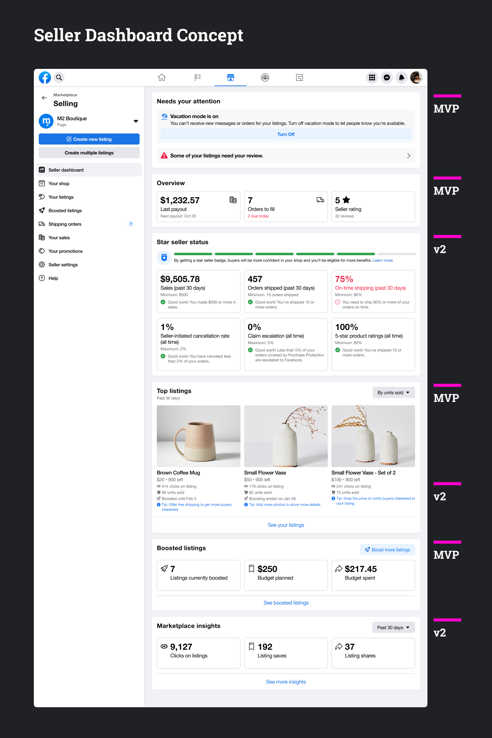
The centerpiece of the navigation redesign would be a new landing page for the sellers we called the Seller Dashboard.
The design of this experience would be modular and accomodate both C2C and business selling use-cases.
Entire cards or tiles within the cards on the Seller Dashboard could be turned on or off, depending on whether you were operating as your main Facebook profile or as a Shop on Marketplace.
Listing Management for Shops
Managing listings is a key part of the seller experience on Marketplace.
Businesses on Marketplace need to update their inventory regularly, mark items as unavailable, and occasionally edit listing details such as description, price, and photos.
Because sales matter for businesses, they also visit the Marketplace listing management surface to compare how listings are performing and boost their listings by creating ads when necessary.
Marketplace was originally designed for C2C selling use-cases, and this was most apparent on the desktop web experience—the large listing rows were sufficient for casual sellers and declutterers with only a few active items selling at any given moment.
The usability issues, low information density, and missing features on the existing listing management surfaces presented a lot of friction for business sellers.
In starting the project, I audited the existing desktop and mobile listing management experience, making note of design issues and areas that could present challenges for business sellers.
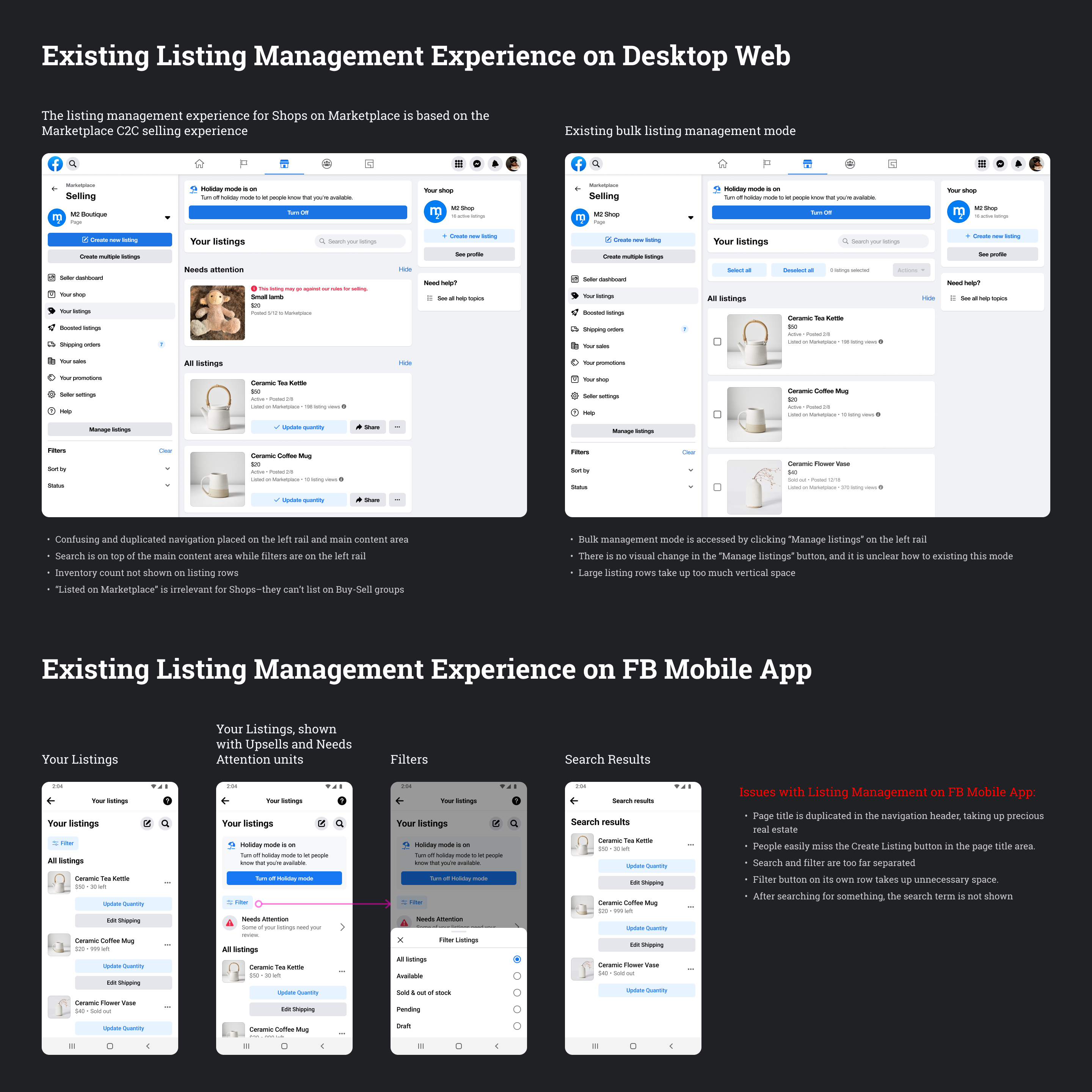
Existing Marketplace Web Listing Management Design
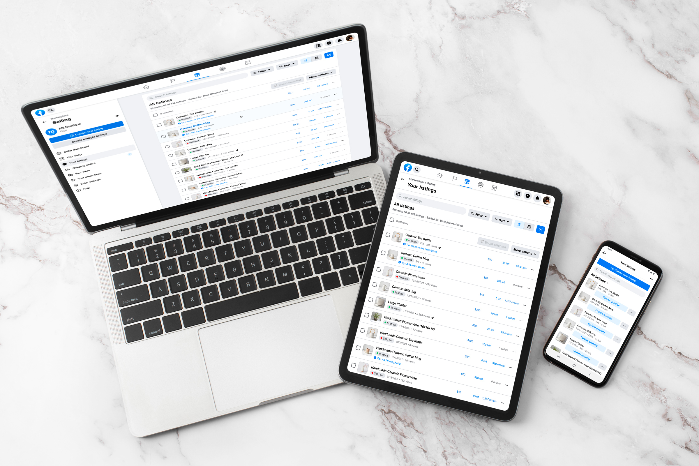
Design for Listing Management on FB Desktop Web
Despite its glaring issues, we found that businesses primarily used the desktop web experience to manage their listings.
This made sense, since sellers would operate other aspects of their business and print shipping labels from their laptops rather than their mobile devices.
Therefore, the team prioritized updating the desktop web listing management experience over the FB mobile app.
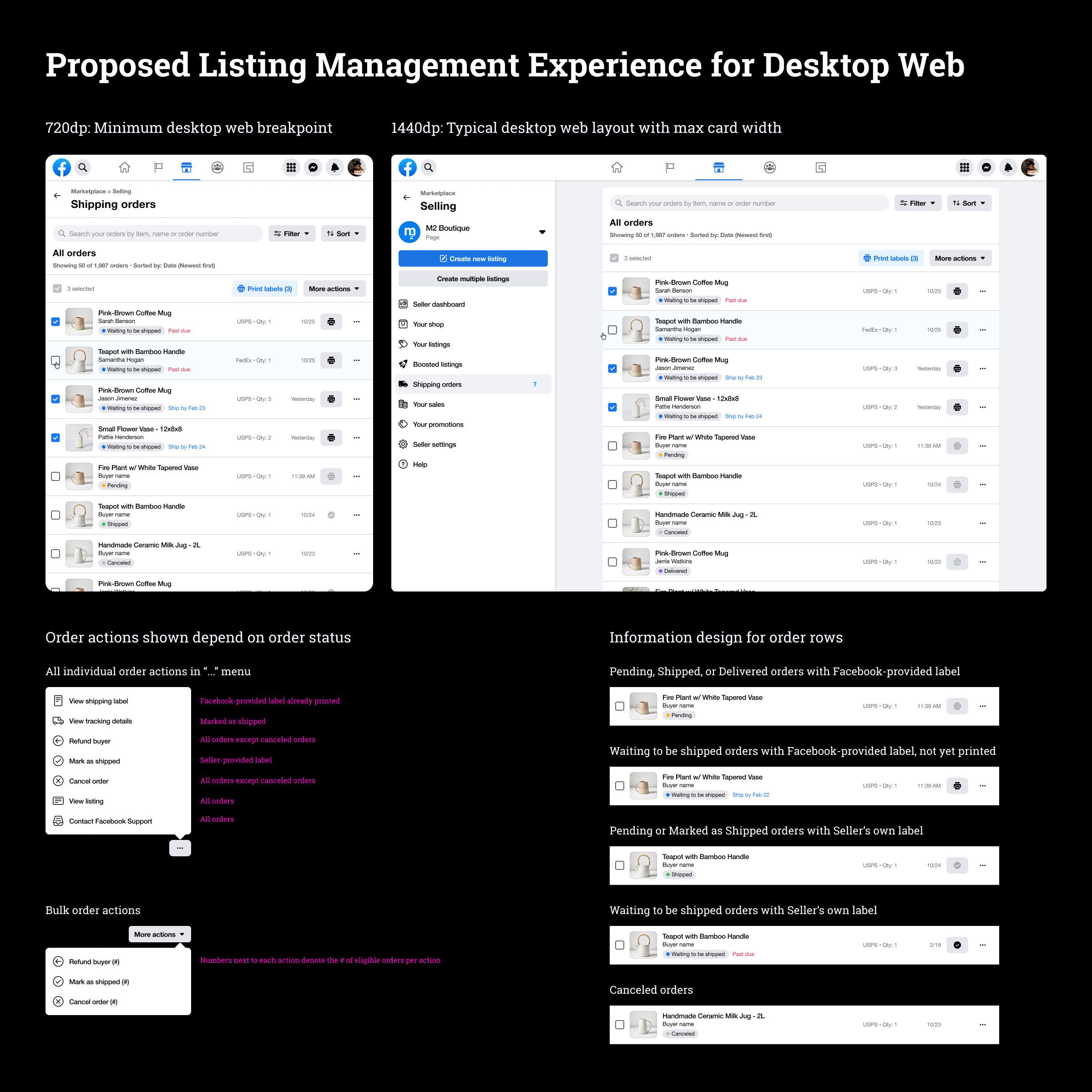
The design needed to work on a variety of screen widths, since the rest of the FB web experience was also responsive to screen widths. I focused my efforts on areas of the existing design that prior research had identified as the most problematic:
- Information density: Sellers needed to see more listings on their screen to be able to compare and find listings more easily.
- Finding listings: Search, filtering, and sorting were confusing and hard to find since each feature lived in different places on the UI.
- Bulk actions: Sellers want to be able to manage their listings in bulk, and the existing experience made it difficult to select and act on multiple listings.
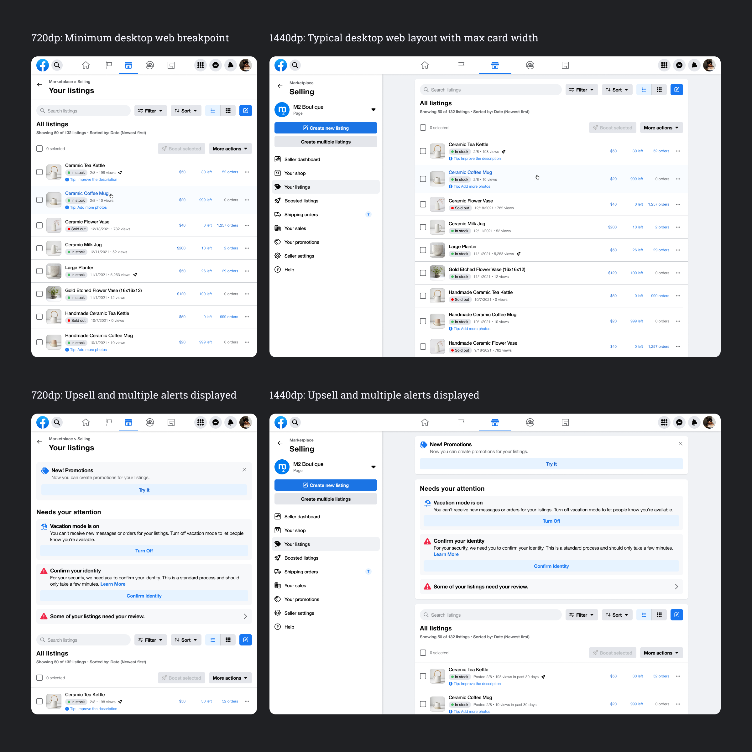
Proposed Desktop Web Design for Shops on Marketplace Listing Management
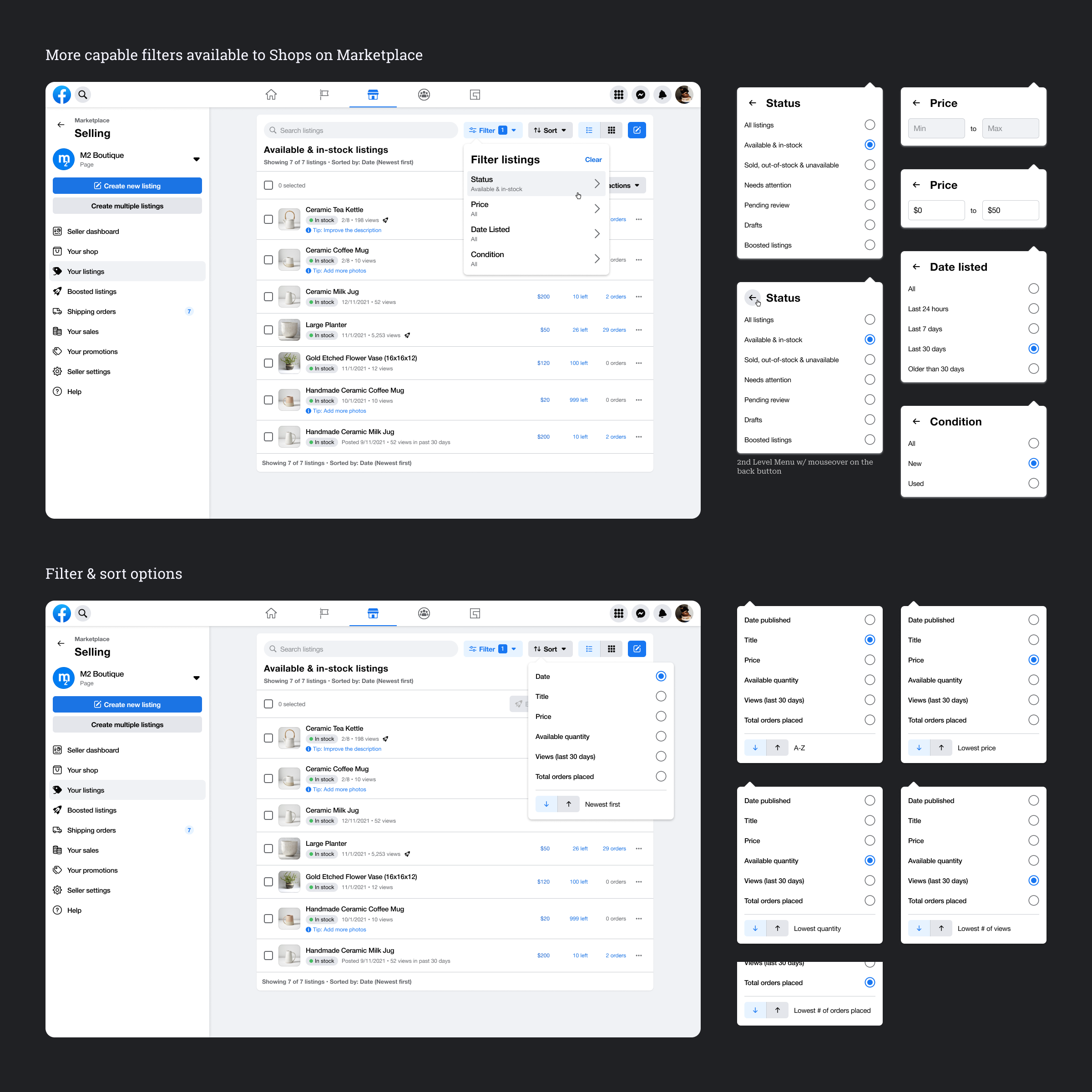
Filter and sort listings
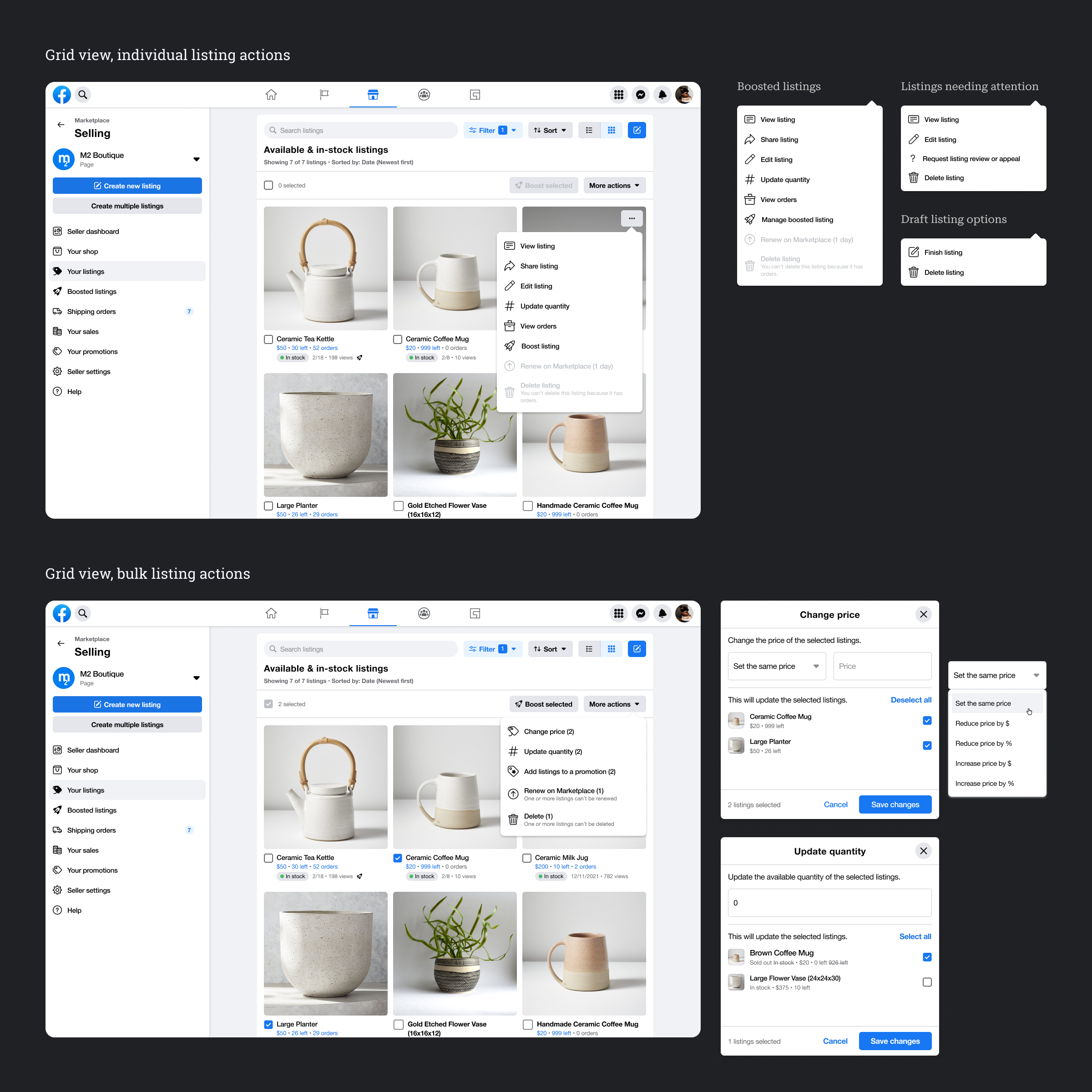
Listing actions
Design for Listing Management on the FB Mobile App
Though the FB Mobile App experience for managing listings was less often used, it could have also benefitted from higher information density and a more usable design for searching and filtering.
Bulk listing actions were also missing from the mobile app experience.
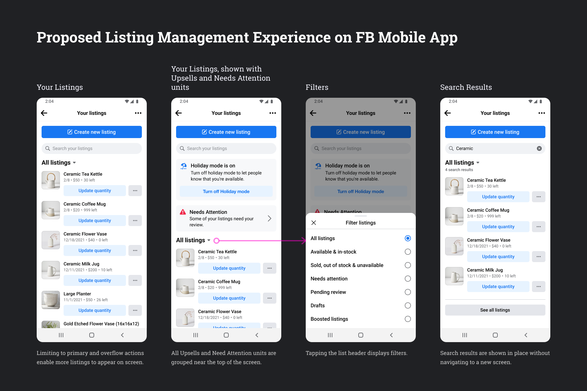
Proposed FB Mobile App Design for Marketplace Listing Management
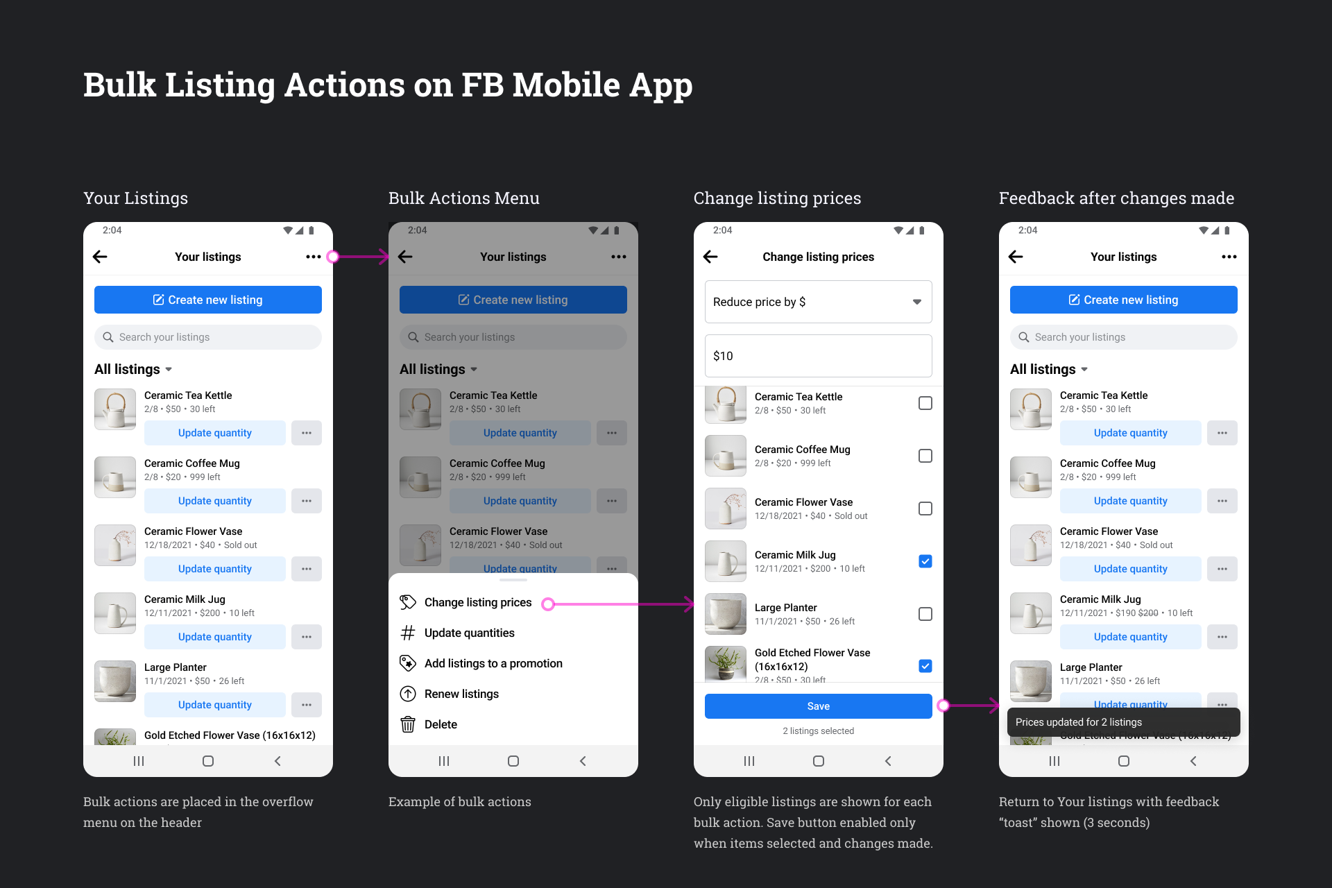
Bulk Listing Actions on FB Mobile App
Order Management for Shops

Order management was another highly problematic experience for businesses on Marketplace, and sellers suffered through many of the same issues as listing management.
- Information density: Sellers wanted to see more orders on their screen to be able to compare and find orders more easily.
- Finding listings: Search, filtering, and sorting were difficult to use. Order rows did not have buyer names, making it even more difficult to find the correct orders in case they needed to resolve problems with specific orders.
- Bulk actions: Sellers want to be able to perform bulk actions, such as printing shipping labels for multiple orders.
Proposed Desktop Web Design for Shops on Marketplace Order Management
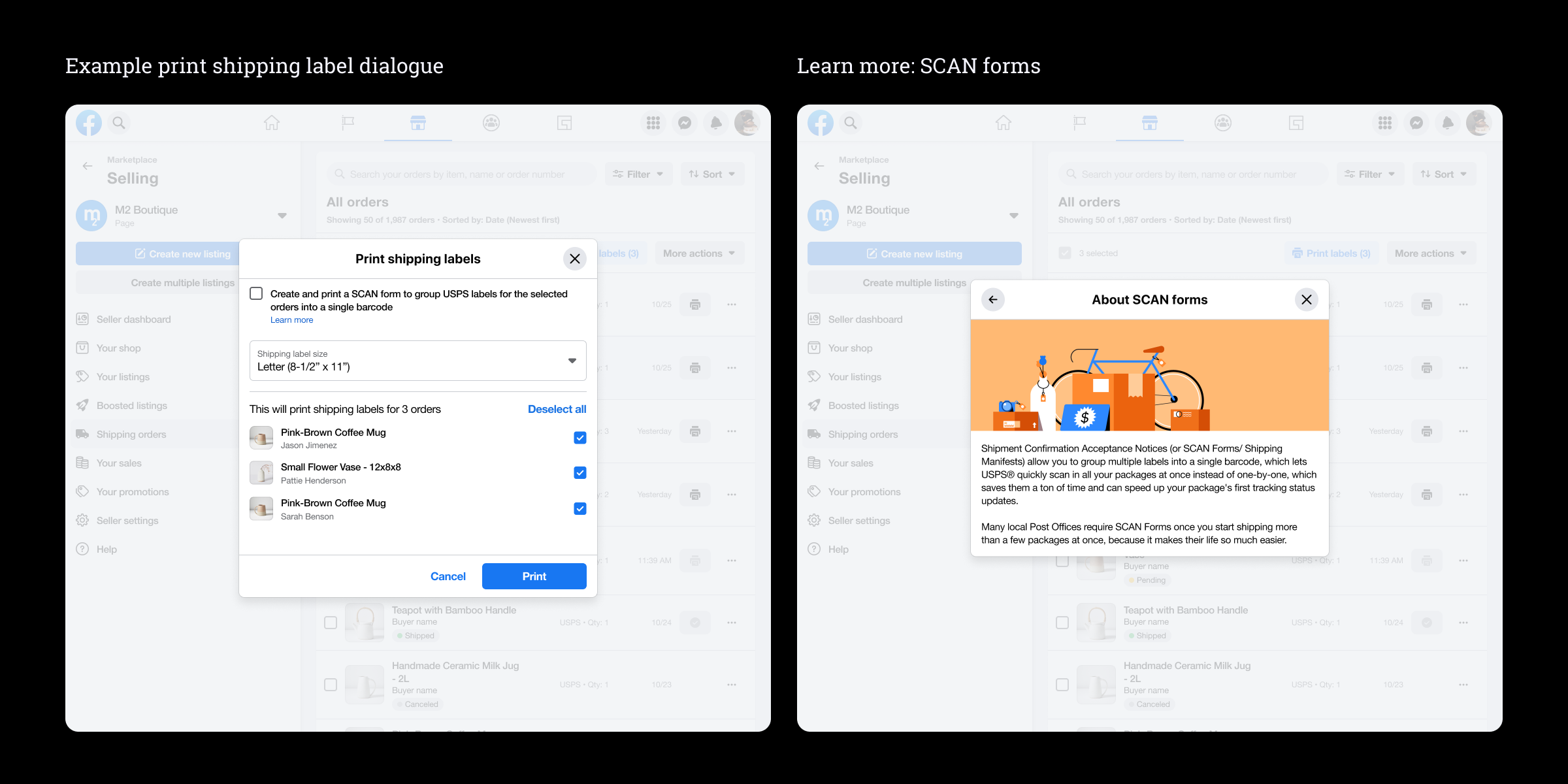
Printing shipping labels for multiple orders